This a very intense 30 second advert that promote a popular game Battlefield 4. The first thing I realised with the video is the use of arbitrary signifiers, the publisher and the developer. The use of striking music and transitions makes the brands and the intro noticeable.
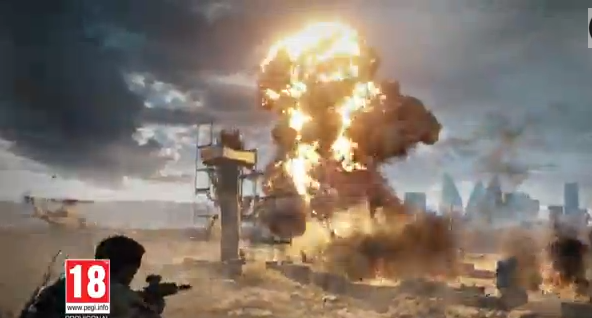 As for the other parts, guns, military equipment and action sequences signifier war. On denotation level this is a game with war. The only people who would appeal to this advert are Battlefield customers and general gamers. The explosive scene applies that this game is action orientated. The use of these scenes would make some people feel intensed.
The production of this trailer must have been time consuming and expensive. Getting the copyright for playing one of Rihanna’s songs as the audio must have cost them around £3000. This is based on my research on previous projects.
Moving onto the clip and camera, there are 35 edits within the 30 seconds. The intro has 2 edits with very striking transitions. This a great introduction because it immediately brings my attention of what the trailer is promoting.
For the remaining parts of the clip, the intensity of the scene changes from 2 seconds onwards is very fast. The edits correspond to the dramatic events and action, such as the man grabbing the gun from the other man. Many of the shots show the scene from the characters' point of view, It only last on 2 for two seconds. The gun scene is very effective because after the man gives the gun, the scenes changes and the movie then reveals the man going to shot the window. This brings a continuous path for the audience experience that is not jarring and not captivating. Another great examples of appropriate use of edit change is the people running from gunshots. As the man gets too close to the camera (close shot), the scene showing a different perspective of the action scene appears.
On the interesting note, there are 3 edits with fade in transitions at the 20 second mark. This is great effort of presenting the game’s environments. Suddenly at 23 seconds, title sequences interrupts its and then it is followed by a 1 second game play clip. This fast sequence is repeated many times, resulting a large number of edits to appear within 6 seconds.
 |
| Although it is not clear, the clip is accompanied by a striking transition |
The some of the fast edits have very striking transitions, making it jarring. However, the pace and the use of mixture long shot and point of view keeps the video captivating.
 This is advert promoting food at fast food retail chain. This clip shows a McDonald store containing people having their breakfast. Immediately the viewer is forced to look at the iconic signifier, the Mcmuffin. When the woman enters the screen, there is one of the most symbolic signifier in the world, the McDonald’s logo. Majority of the scene show the logo in the background to get that this is an McDonald’s advert in their heads.
The overall feel of the advert is comical. After the woman realises that she sitting with a stranger, not her boyfriend, she immediately finds her boyfriend.
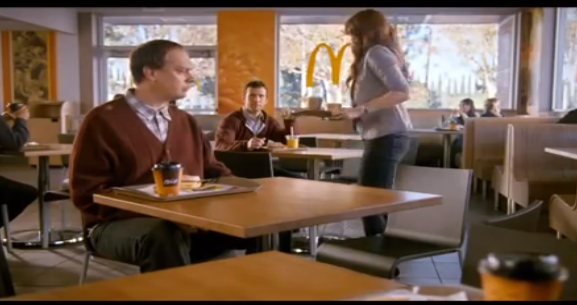 For the production many camera men and light equipment were used create a visual pleasing clips. They might have recorded about 1-3 hours worth of video content to ensure there is enough clips to inserting into the editing software.
Lets talk about the small number of edits within the McDonald’s advert. Unlike Battlefields advert, the scene length for this longer, making it less exciting. With less scene changes, there is a possibility that people would most likely to loose interest.
This shows the audience a second person’s view of 2 people having a meal. For the first 5 seconds, the camera reveals a close shot of a man eating a burger. Behind is a blurry background that makes him the main focal point. The camera changes just before she sits down. I realized that the edit on 0:04 is important because the following scene shows more products and the brand logo. The close shot of her scooping up the ice cream appears at the 7 second mark. The positioning of the logo on the ice cream container causes the logo to strike the viewer. Another edit appears when she eats the food, creating a good flow.
Another great feature of the advert when is the use of edits when a person is eating or speaking. At the 0:11, the man is moving his forward but when he eats it, a clip revealing him eating the cream from the font appears.
 Overall, this advert features a great theme but does not contain enough edits to maintain the audiences’ attention. The reason why I conducted research on slow clips is to ensure that I know what not to do with a short clip with many edits. However, if dialog is used, I will explore the comedy theme.
Overall, the advert consists of mid shots. This is to allow the audience to see enough of the scenery(the resturant).
This is a Nikon advert promoting its camera range. The main element that signifies that their camera a great quality is the clips. Many of the clips are very vibrant and very clear. A great example of this is the shark scene. There is a high contrast and great lighting effects that represents the high quality of Nikon footage.
 Unlike the previous examples the arbitrary signifier, the text, are also iconic. In the lot of scene, there is a girl resting. A text sequence showing a pun, ‘I am recharging’ that represents the feeling of resting. With the animation it connotes that the camera charges at a fast rate.
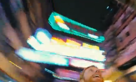
Another great signifier is the man moving his camera in an urban environment. This clip signifies that moving the camera would not ruin the quality and maintains the high frame rate. The use of a low angle shot and a eye view is an interesting shot. Swinging it around offers a great sense of movement.
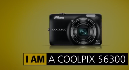 Overall the audio is symbolic and iconic because there is no clear connection between the audio and the brand. However, many people may have heard this song on another Nikon advert, making it iconic. Whether it is royalty free music and produced by their talent, they have must used Audio editing software, like Adobe Audition, to achieve a great and high quality song.
 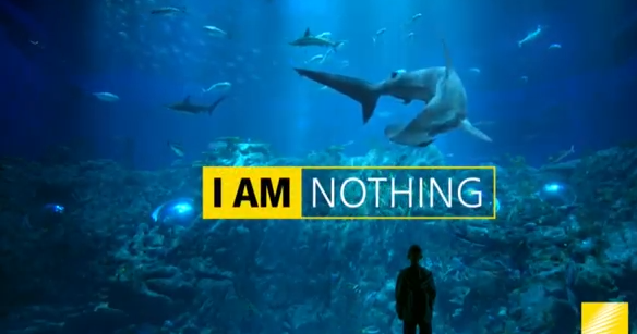 The clip at 0:20 is great effect that people would most likely remember. The scene is unfocused and is zoomed in but it become clearer when the camera focuses on the lights. This is an interesting effect that is commonly used by professional editors of adverts and movies.
The footage is perfect example that demonstrates that edit can be a new object or element appear on the screen. After the second edit, text appears on the image. The then suddenly reveals animation, which is considered as an edit. The use of animated text is used on the following times: 0:12 and 0:22. Afterwards, there are 2 edits appear on screen; the appearance of text and the camera. This repeats itself many times by the colour the camera constantly changing and the text revealing the name of the model. This makes the last seconds of the trailer look interesting.


No comments:
Post a Comment