Since we are on the topic, it would be a good idea to gather a good range of them and conduct an analysis to help me produce a guide line.
Colour
One of the main subjects of a guideline should is the colour scheme for the overall design and logo. I would have to ensure that colour guide is clearly presented and clearly show the colours specifically for the book cover . This includes applying different colour palettes that justify the design decisions. In this case. the main content will be about the colours featured on the front and back cover.For this example that I gathered, the colour clearly state the Hex, RGB and CMYK values that are used for web and print respectfully. This page only features 3 primary colours associated with the core brand. It gives specific instructions to not use a particular colour in certain circumstances.
Typography
As for typography, the guide should show provide information on the design of one or many font face that demonstrates the characteristic of the book. To justify, each font should have information of the recommended kerning, size, stem thickness and font features to demonstrate the characteristics of the design. The content should include headings, sub headings, captions, quotes and main body The best method of presenting text is to use a diagram that makes it clear what the content is referring to. The type of fonts shown will vary depending on what book I have chosen to develop a book cover for.The typography page on this Brand Guidelines from Apple provides information of the name of the font . It also gives you the specific font size minimum, which is 5pt. As for the tag lines, the text should be written in bold to ensure that the title stands out. The font's letters are positioned next to each other to demonstrate why the font should be used for the content.
Composition
Composition is a detailed subject to cover because there many tools and features that need to be mentioned. The documentation should include different examples of the expected layouts for the design. This is to ensure that the is enough options are provided for the contractor to follow. In addition, the composition should display the use of grids to demonstrate how to organise the content. This includes using methods of arranging the graphical elements, such as 360 and 960 grid. The use of the grid should be shown on a large and simple images that enables the reader to understand the rules.
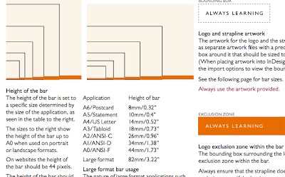
This example of a guideline gives the specific dimensions of the document to help design scale the bar to their expectations. Having this information is important because Pearson want a website that looks natural to the user. This guide also covers the padding surrounding the logo.
Images
It is essential that branding guidelines contain instructions on what type of imagery should be applied into the design. This ranges from bitmap images, such as the photographs of people, to symbols. Imagery that is expected depends on the company style, their target audience and the type of service.
Skype is a great example where it tells the designer to use specific imagery for each demographic. The image above are illustrations that should be used in documentations that are aimed at students. This feature allows the guidelines to be very clear and precise.
Comparison
References
http://www.channel4.com/about_c4/styleguide/downloads/f4/Film4-Off-air-Identity-Guidelines.pdf
http://www.apple.com/legal/sales-support/certification/docs/logo_guidelines.pdf
http://issuu.com/bondo/docs/skype_brand_book_-_look


No comments:
Post a Comment