Before I go into my inspirations, I need to justify why I have decided to produce a cover for The Outsiders. Whilst reading the book, I was able to visualise the characters, the period, the famous icons, products and style. I was then able to develop these basic ideas into sketches.
What A Carve Up in the other hand, was an uninteresting book. By the middle of the book, I gave up reading it because I found it very hard to visualise the story in my head. This therefore made it impossible for my to develop mind maps that responds to the book.

Dynamic colour scheme
This my inspirations for my colour scheme and the style of imagery. This section of the post justifies why colour schemes of the image entices to apply it on the final design. All of images above in the move board has a retro feel that symbolises the 1960's.
In terms of the red, I think red symbolises the American diner interior and exteriors colour colour scheme. The use of the colour on some imagery makes graphical elements the main focal point. This colour also relevant because Coca Colo and Pepsi glass bottles feature this on the lable. These symbolic signfiers were among the Greasers' favourite drinks.
To create a large contrast and insert a sense of calmness into the design, I may inset different shades of blue. This colour emphasises a message that the characters spend some their time chilling out. Many chapters of the story includes scenes of the treasures laying on the floor, especially, Ponyboy dreaming a better future. This type of colour will be used for night time scenes or a book cover of Ponyboy dreaming.
This will be the primary colour of the mustang. The book specifically states that the Soc's vehicle is blue
To create a large contrast for the typography, yellow. If I develop an idea of a cinema or an American Diner theme, this will be one of the primary colours. Yellow is an aggressive colour that was used in the period of Pop Art, especially in Litchenstines art work. This colour compliments red very well. A combination of these colour makes a design look very dynamic due to both colour being bold. This would benefit the American Diner sign containing the title of the book.
Photographers: Inspirations imagery style
Dorthora Lang
 The story regularly brings a sense of sadness that the Greasers experience. Her photos generally feature either emotionless or depressed due to their circumstances. Although the pictures originate from the depression period, I can imagine the mood of photo relating to the hostile life of the Greasers. The picture of the Greasers looking sad or angry makes a bold impact.
 Weegee
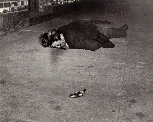
Weegee's photographs are perfect examples of very powerful images. His images features a bloody crime scene that looks very horrific. Although this is too gory for a 12 year or a parent to view, I will use arbitrary signs, like text, to represent this type of imagery. I feel this is relevant because a murder and a few fights occur in the story.Garry Winogrand
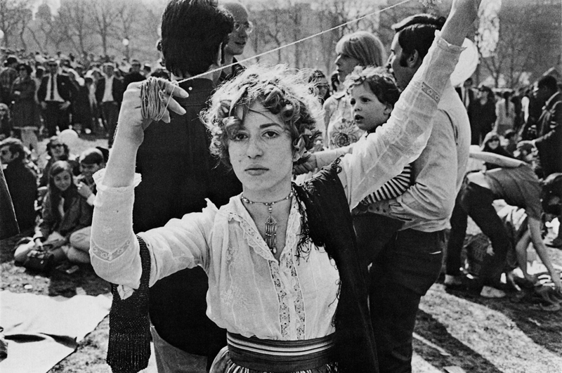
Garry's Winogrand's photography convey the opposite feel. The image of the woman dances emphrasies that she is expressing herself. This image iconic symbolises the creative movements that started in the 1960's. His other artwork includes people enjoying their leisure time. A great example of this is the woman shopping.
Typography
Images with imagery: 1960's

These are my inspirations for my typography from this period. I want to includes a theme on a typography that symbolises America in the 1960. This includes retro billboards, road signs, diners and neon lights. Applying this style of typography into The Outsiders book cover would allow the text to be iconic and arbitrary sigifiers that enhances the theme and connotations of the sign. These styles are approbate because many scenes feature an American diner and locations.
Typography inspriations (retro)

To develop these themes, I explored typography that conveys 1960's America accurately. I think style of typeface that symbolises the classic American billboards is script face. Script faces feature elegant curly lines that join all letters together. The only issue that need addressing is the kerning and its legibility. To solve this problem, I need to get a font uses joined up capital letters. This type of font will bye used to for the name of author to make it noticeable. To ensure it is readable, the fist letter should not be joined so that the reader can differentiate the capital letter.
In terms of thick ness, I want to create an anolmy to make a word stand out. I intend to use this attribute on the word "Outsider" to make one of the main focal points.
In terms of normal san serif fonts, the typeface design used by Mister Retro would symbolise the font used on a mustang. The mustang is the primary vehicle for the Socs, applying text with a font resembling font style on the car would be a good arbitrary and iconic signifier that makes a reference to the gang.
To create text that symbolises the Greaser, I will attempt to apply text that looks rough feel. The Greasers live in a hostile part of Tulsa, therefore it would make sense that text that represents their lifestyle is implemented into the design.
References
http://www.hipstercrite.com/wp-content/uploads/2012/01/88291_original.jpg
http://grainedit.com/2013/07/03/eric-tan-fly/
http://www.masters-of-photography.com/images/full/friedlander/friedlander_portraits_garry_winogrand_new_york_city_1957.jpg
http://grainedit.com/2013/07/03/eric-tan-fly/
http://www.masters-of-photography.com/images/full/friedlander/friedlander_portraits_garry_winogrand_new_york_city_1957.jpg
No comments:
Post a Comment