Trafic light
Design
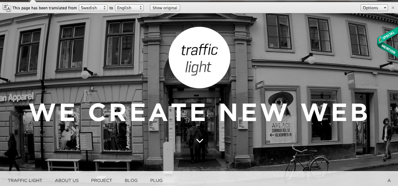
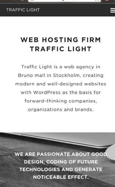
When observing at the image effects and the graphical elements, I thought the website offered a vintage and retro feel. The use of vector shapes, such as the circle, makes the website look clean on the screen. This is a great practice to follow because website need to look visually pleasing on future devices.
Simple is the key word to describe the page designs. The designer has chosen to apply a nice simple background that offers clarity and uniformity. Using white and black enables the images to blend in. This helps the website to establish a relationship between the pictures and pictures. The black and white filtered applied on the imagery causes them to strike the audiences' eyes. This results in the pictures being among on top levels of hierarchy.
Typography
There is a great use of many type families presented on all pages. The bold Helvetica font entices the audience to red the tagline 'we create new web'. Applying capitals gives a sense of power to the headings and tag lines. Upper case letters are used to signify shouting or offer posters the ability to encourage customers to take a course of action
Design navigation and animation
The designer has done a professional job at presenting a massive vertical navigation bar. The scale of the text makes the process of navigating through the website is easy. The pop up menu features a nice transition that makes the navigation look smoothe.
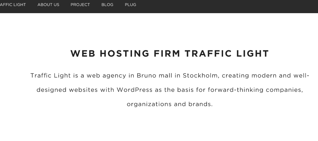
However, the navigation bar on the home page looks slightly out of place. The other pages feature a horizontal navigation bar on the top of the page whilst the home page navigation is postioned at the bottom. Although it can work if there is enough striking elements that causing the navigation bar to be the 2nd focal point, having just a white background for the links does not achieve that.
Responsive design
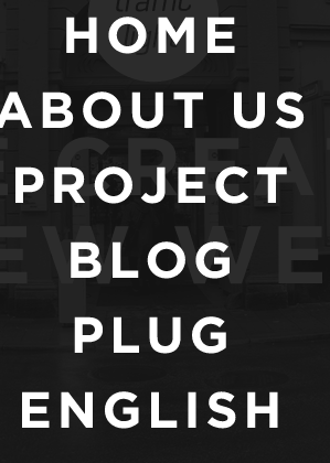
When I scaled down the website, both the Iphone and the Ipad website were professionally designed. One of the dramatic changes in the design is the navigation. The image below presents the home button on the top right of the banner. The left section of the header features a navigation drop down menu leading to all sections of the site. Being a fixed navigation bar causes it to be seen at all times, therefore, making the process of navigating to other very quick.
Having the text centrally justified is another great typography feature. Justifying the text cleanly presents the content to the user. The font and and the content are highly legible and readable on both iPad and iPhone
The layout on the desktop and the Ipad versions are very simliar in certain aspects. There are 3 image c presented on the row on both versions. It common for Ipad sites to only have two columns but the designer has chosen to make the image florid. The image seen on the Ipad are smaller compared to the computer website.
http://www.trafficlight.se/
Shokunin
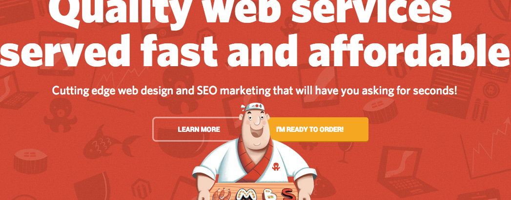
Skokunin is a very imaginative website with relevant content and very effective use of colour and typography. The home page reveals a detailed illustration of a waiter that acts as metaphor for serving a great web service. The background features red but there are slightly faded web themed illustrations to enable the user to figure out the website's theme and products.
As for the content, I enjoyed the concept of using puns make this website look comical. The word 'Can I take your order' is a link that would apply ordering food. However, this leads the users to an application for hiring the web services.
Typography is one of its boldest components. Presenting one font's type families makes the website look consistent and simple. The headings feature bold character whilst body content feature the regular letter forms.
The colour conveys a sense of happiness and power. In context red is often is to assoicate China and its food. The colour compliments with the comical theme and compliments the yellow and white. Against a white background, the red comes across as elegant.
The interactive page is the most engaging part of the website experience. The image shown below is an image gallery positioned inside a graphics tablet illustrations. Although the section needs captions to explain each picture, the detail and the visual imagery makes this one of the most memorial parts of the website.
Responsive design
I generally think that the phone and the graphics tablet website is very engaging. The header only reveals the tagline and the link that takes the user to application form. The empty white space makes the content very visual. The website is quite text heavy but the spacing on the phone site creates relationships between the image and the content more than the content website.
As for the layout, the Ipad version cramps the content and images together. Websites with cramped information maybe off putting.
Navigation and interactive elements
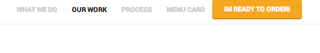
Unlike other websites seen, activating a link causes a very fast moving animation sequence to occur. When the user selects ' I'm ready to order' button, the website immediately scrolls down to the bottom part at a fast pace. There is a form that enables user to input the details. Beneath it are 4 links that allows the customer to select the kinds of service required.
However the navigation is quite unusable when viewed on the phone and a graphics tablet. When the 3 lined button is press, the website presents a new page with the primary links. However the illustrations overlap the links, making the text illegible.
http://www.shokunin.pro/en
I thought to get some retro design inspriation, I decided to conduct some research onto a retro designed website. When I entered the webs page, my initially thought the design was very vibrant. The colour scheme generally signify nature. The use of pale and strong great offers the design great depth and elegancy. The complementary colour red is draws the audiences' eye to the tag line and the brand name.
One of the greatest aspects of the site is the hierarchy. The heading font features very bold characters that strikes the user's eyes. The use of of anomaly also draws the audiences' eyes to the heading. Some headings features a bold word but it followed by word featuring condensed or italic styles. It is a great gestalt principle to apply to enhance the hierarchy structure.
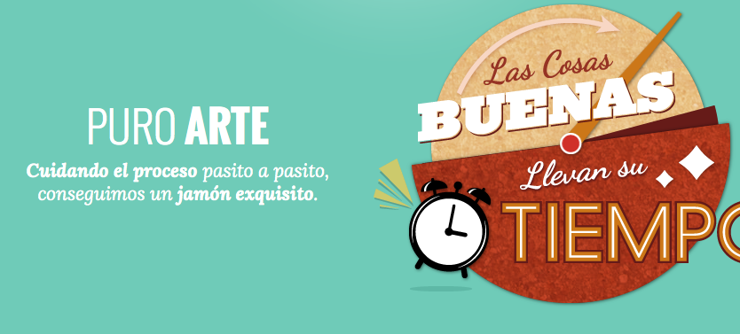
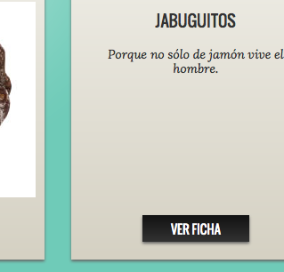
The visual imagery on the site creates an enjoyable user experience. The imagery is relevant because they all promote an aspect of the surface. Although the website is written in Spanish, the clock image is adverting that the food company does take aways or their restaurant surfaces are very efficient. However there should more information and links that helps the user to find all the information needed in all pages.
Having a search for info button enables the user to explore secondary information. The boxes containing them feature a simple heading and a brief description about the image. This may prompt the user to select the link and navigate to the related page. Overall it is a great concept but I think it may divert the audience from the path. Having too many pages causes the navigation process to be bit confusing. My solution to the issue is to present a box with a short paragraph but there should be a button that reveals the remaining content.
Navigation and links
One of unique buttons featured is the mute and sound on button. When the button showing a microphone is activated, suddenly music can be heard. It is a creative concept but I do not think is a good relevent feature. There should be another element that is more essential for user to interact.
The positioning of the social media website links could cause people to leave the website. Social media links are OK but they should the last part of the hierarchy. I would advise the design to place the links down to the bottom of the page.
Although the navigation bar resembles the one analysed in the article, there a problem with the programming. When viewed on the Ipad, there is no navigation bar and no site map. This makes it impossible for either the Ipad or the Iphone user to navigate. This will prompt them to leave the website.
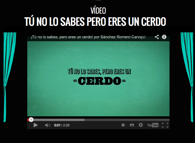
The other interactive elements I enjoyed viewing is the video. The imagery surrounding the YouTube video offers a cinematic feel that creates an enjoyable experience. This design attribute prompted me to view the clip. The layout and consistent use of one font also made page look visually pleasing.
http://sanchezromerocarvajal.com/la-jamoneta
Design and responsive design
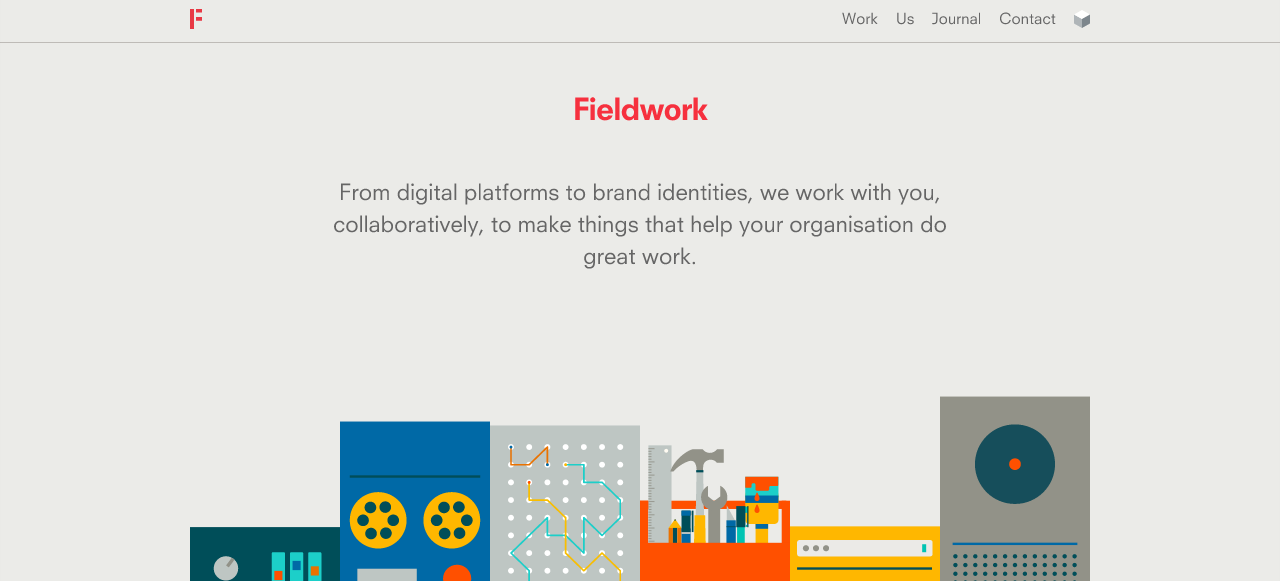
The illustrations are one of the most visually striking graphical elements on the home page. These vibrant illustrations add a creative feel. The illustrations first signify that the company produces art and web work. Against the background, the elements really standout.
Red is a very elegant colour that draws the user onto the headers within the website. This enhances the reading experience because it allows the to use the headings as reference points. The quanity of text does not become overwhelming due to the strong heading design.
Typography is
Responsive design
The designer has professionally designed the website for all devices. The design as really done a great job at making the content presentable on the other pages. I realised that the presenting 3 columns of information on the Ipad is very common. Not making the web page long reduces the need of scrolling in long periods. As a designer, I would present the information very efficiently.
I do enjoy the concept of not adding too many characters per line on the Iphone version. The phone site reveals 1 column of information. However the scale and the choice of font causes the content maintain the audience's attention.
Navigation
The horizonal bar is very interesting when viewed on all devices. The navigation links are postioned nearer to the centre of the page when the width of page is reduced. However, there was a button that I have never came across before. There was a buttons that reveals a drop menu for the other information. It is common for drop down menus to reveal sub sections. There is a sense of the drop down menu has been unprofessionally design. There are some links without an underline, which suggests that they are not active links. It many take a long time for the user to figure which out of these words are links.
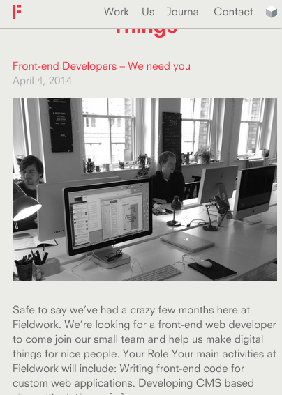
http://madebyfieldwork.com/

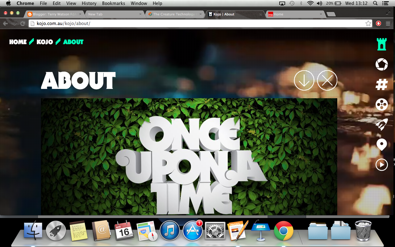 Kojo.co.au features a very visual and very responsive navigation bar. The symbols are great imagery for students, the target audience. Many students are visual learners, therefore having symbols as well as word may alert to know the subject that the linked page offers. When the navigation is hovered, the image slightly rotates. This makes it obvious to the student that the links is active.
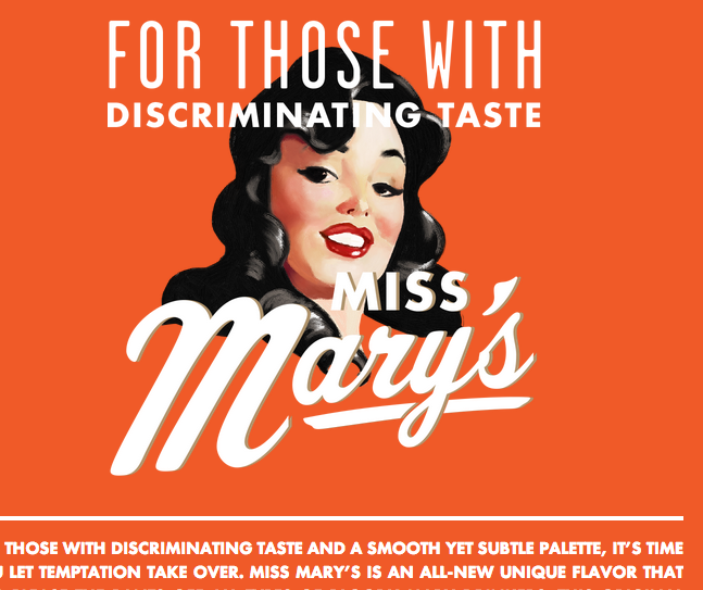 As retro was the visual style used in the Ibooks, it would make sense to conduct research in vintaged designed illustrations. I thought the typography found on missmarymix would be great grab the student's attention. The script face font is very reminiscent of many font found on retro designed posters. One of the main aims for the website is to create noticeable moments in the site that will cause the audience remember the content and style. The script face font will only be used to present additonal information of the image.


