Content
Both Field work and Done Done are very inspirational websites with great quality content. They both feature a sentence or 2 that describes the website. A home page should feature a navigation bar with a sentence about the subject in order to prompt user to explore the website.
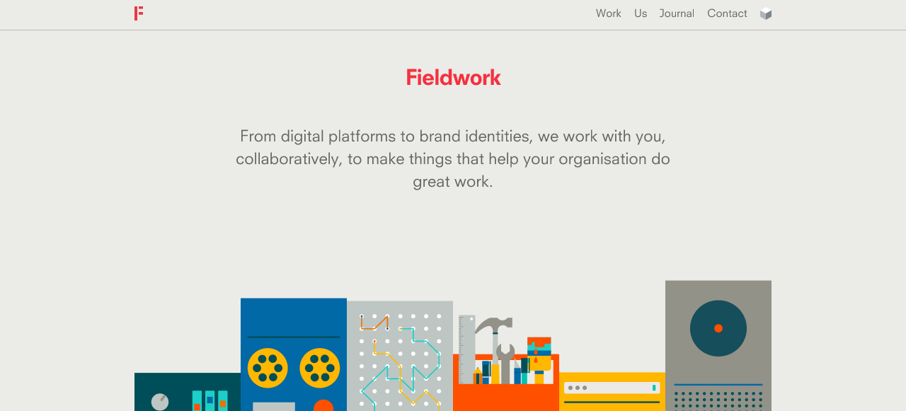
With Field work, I enjoy the concept that the illustrations make the website look clean and visually pleasing. They all signify what the website offers without reading the content. As for responsive websites, the designer has successfully designed a phone site with these illustrations. In order for Iphone home page to work, the quantity of illustrations were reduced.
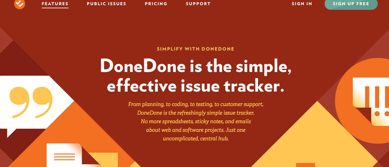
Done Done is another great website with great content style. Many of its pages feature one or two paragraphs next to a very visually effective illustration. Differtiating each section is a great attribute that separates the content into small blocks. Each topic has its own section of the page where it features its own colour scheme, illustration and headings.
Navigation
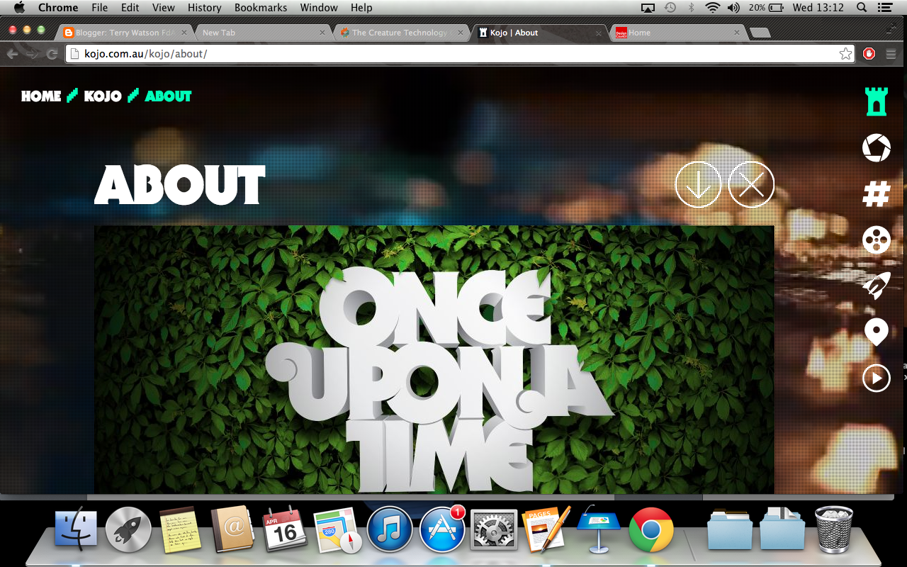 Kojo.co.au features a very visual and very responsive navigation bar. The symbols are great imagery for students, the target audience. Many students are visual learners, therefore having symbols as well as word may alert to know the subject that the linked page offers. When the navigation is hovered, the image slightly rotates. This makes it obvious to the student that the links is active.
Imagery, colour and typography
http://missmarysmix.com/
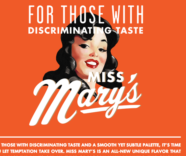 As retro was the visual style used in the Ibooks, it would make sense to conduct research in vintaged designed illustrations. I thought the typography found on missmarymix would be great grab the student's attention. The script face font is very reminiscent of many font found on retro designed posters. One of the main aims for the website is to create noticeable moments in the site that will cause the audience remember the content and style. The script face font will only be used to present additonal information of the image.
A normal san serif would be used as headings. Bold san serif text allows to focus on the heading. San sanifs font feel more democratic, therefore using the san serif fonts would convey the right theme.
Using many type families within the same font to establish hierarchy is a great practice. The content body text is smaller and looks less bold. These factors enable the heading to stand out. A website with massive content, such as mine, having this characteristic would enhance the user experience.

This website has a similar colour scheme. The use of the 60 30 10 rule enables this website be visually engaging. The website uses a great range greens to add depth. I generally feel the use of solid colour causes the page to look trendy and clean. Placing red, orange and white in the most important parts of the site enables the audience to get the necessary information they need. I felt applying the same method of establishing hierarcy would enable the students to learn coral reefs.

The layout is another successful component. Each column has its own image or illustration above the heading and text. When the website is viewed on the Ipad, it just reduces the scale of both the columns and the images. As mention I thing that having 3 images on a row rather than having 2 does not require the user to scroll. I would admit that the Iphone version should have 1 column of info.

Referring to Filed Work's website, the content is underneath a massive image that consumes the entire width of the site. To make it proportionally look right, the headings are smaller to ensure the page looks balance.
technical research
Joomal CMN
Joomal is a great content management systems that allows website developers and clients to change the website's content. It offers users a simple interface that allows them to insert HTML elements, such as video, without knowing the code. Making the content dynamic is one benefit of using a content management system. Clients or employees who have accessed to the website can correct, edit or add the information.
Hosting
Websites need hosting in order for them to presented on the internet. Hosting companies provide clients with domain names, the url, databases and other advance features. The price of getting the domain name depends on status of the clients. It is common for clients to pay a business tariff in order to get more domain names and perks. Reg123 also provide a premium tariff that give businesses unlimited access to some tools; for example the databases.
No comments:
Post a Comment