4th Reseach session:
After I completed the hard section known as Victoriana, I decided to finish my research
What is science fiction and recent history.
Science
fiction is a genre of movie and book that incorporates technology, logic,
science and fantasy together to create an imaginative form of content. The main
aim for science fiction is give the audience a question ‘what if’. Current concepts and interpretation on how
the universe works are taken and put into a form of a media, such as books and
movies, to create a world with technology and sometimes a society that we never
seen before. A good examples are
planets, the Death Star and aliens.

This genre of
fiction consists of two well known categories: Hard and soft science fiction.
Stories that revolve around technology that are more ‘advanced than our own’
but sometimes, the technology featured maybe possible to invent one day is
known as hard science fiction. Content with elements of time travel, for
instance Doctor Who, is considered as soft science fiction.
Science fiction was made global when the gerne reached it's golden age in the 1950's. The period saw popular movies like the World Stood Still. Movies like Star Wars and Tron, have inspired current directors and producers to create very interesting science fiction movies are now regularly produced to entertain people.
Movies or books:
Examples of Early 20th Century books and posters
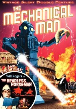
The Mechanical Man
After finding some posters on Google images, I found one that appeared shocking. Although I do not know who is the designer, I do like the concepts of
using aggression to promote this scary looking poster.
Here is my awesome review with my constructive opinions.
 This early science fiction poster shows a mechanical giant who is causing terror to Italy. The image features the giant carrying the woman whilst firing the laser at the people. All aspects of the imagery is part of the artist's imagination, such as the intergalactic laser or death ray, at the time when the movie was released. The creature featured in the poster resembles to the more well-known science fiction monsters like King Kong and Godzilla in terms of size. The imagery expresses a terror theme for the movie.
In terms of structure, there are too many images positioned everywhere, making it look disorganised. The title is warped around the giant robot and the woman to prevent overapping ocurring. All of the destruction and elements associated with danger, such as fire and lighting, are used as the background to convey a destructive theme.. At the bottom right, there is an alternative product presented to the viewer, which makes the advert too busy, to encourage the t
The title attracts the viewer first because of the glow effect presents the San serif text as bulbs of lights. To intensify the electricity effect, lighting strikes are positioned coming from the text and the font's steams are straight. The next focus point is the giant creature that describes the key themes of the story. It informs the audience that the plot contains a destructive robot causing terror.
Overall, the feelings of terror and excitement are conveyed as due to the laser causing destruction. It looks very busy for advert but in terms of visual language, it is very disturbing.
Woman in the Moon

Translated into English as 'Woman of the Moon' is a German science fiction movie released in 1926. Compared to the Mechanical Man, the imagery features a dark colour scheme and a space rocket as the centre of attention. As the space program did not started until the 1950's, this therefore, at the time of the movies released it is fiction. However, the concept of the rocket was not part of a world of imagination due to the famous weapon rocket launchers that existed at the time. The title 'Woman on the Moon' suggests that plot revolves around a woman traveling to the moon.
The camera perspective makes the viewer see rocket as if its travelling away from the camera. On the right part of the rocket, the title is positioned there to give the rocket enough space. If the composition showed the text on the top right, there would have not been enough space for the additional information like the main actress.
The most noticeable feature on the graphic is the basic designed rocket. At the time, rockets traveling in space was time presented for the first time to the audience in United Kingdom and Germany. The shape and design of the rocket had to be simple and recognisable. The lighting effects on the rocket also creates a 3D depth to the objec.
The dark blue also helps the text to be the next focal point. The typography used consists of a o that looks like a wide zero to represent the number 0, which is the number that is used for liftoff. This feature alone would persuade the everyday audience to watch the move because a number next to a spaceship promote the themes efficiently. Using bold letters instead of very thin ones makes the reading experience for the audience easier because thin text on dark background can blend.
- The Day the Earth Stood Still (1951)
- Astounding Science Fiction Vol.XXII No.3 November 1938 (Reunion on Ganymede; The Silver Sphere; Simultaneous Worlds Pt.1; The Tramp conclusion)
- Island of Lost Souls (1932 film)
- The Mechanical Man
Examples of Early 20th Century books and posters
The Mechanical Man
After finding some posters on Google images, I found one that appeared shocking. Although I do not know who is the designer, I do like the concepts of
using aggression to promote this scary looking poster.
Here is my awesome review with my constructive opinions.
 This early science fiction poster shows a mechanical giant who is causing terror to Italy. The image features the giant carrying the woman whilst firing the laser at the people. All aspects of the imagery is part of the artist's imagination, such as the intergalactic laser or death ray, at the time when the movie was released. The creature featured in the poster resembles to the more well-known science fiction monsters like King Kong and Godzilla in terms of size. The imagery expresses a terror theme for the movie.
In terms of structure, there are too many images positioned everywhere, making it look disorganised. The title is warped around the giant robot and the woman to prevent overapping ocurring. All of the destruction and elements associated with danger, such as fire and lighting, are used as the background to convey a destructive theme.. At the bottom right, there is an alternative product presented to the viewer, which makes the advert too busy, to encourage the t
The title attracts the viewer first because of the glow effect presents the San serif text as bulbs of lights. To intensify the electricity effect, lighting strikes are positioned coming from the text and the font's steams are straight. The next focus point is the giant creature that describes the key themes of the story. It informs the audience that the plot contains a destructive robot causing terror.
Overall, the feelings of terror and excitement are conveyed as due to the laser causing destruction. It looks very busy for advert but in terms of visual language, it is very disturbing.
Woman in the Moon

Translated into English as 'Woman of the Moon' is a German science fiction movie released in 1926. Compared to the Mechanical Man, the imagery features a dark colour scheme and a space rocket as the centre of attention. As the space program did not started until the 1950's, this therefore, at the time of the movies released it is fiction. However, the concept of the rocket was not part of a world of imagination due to the famous weapon rocket launchers that existed at the time. The title 'Woman on the Moon' suggests that plot revolves around a woman traveling to the moon.
The camera perspective makes the viewer see rocket as if its travelling away from the camera. On the right part of the rocket, the title is positioned there to give the rocket enough space. If the composition showed the text on the top right, there would have not been enough space for the additional information like the main actress.
The most noticeable feature on the graphic is the basic designed rocket. At the time, rockets traveling in space was time presented for the first time to the audience in United Kingdom and Germany. The shape and design of the rocket had to be simple and recognisable. The lighting effects on the rocket also creates a 3D depth to the objec.
The dark blue also helps the text to be the next focal point. The typography used consists of a o that looks like a wide zero to represent the number 0, which is the number that is used for liftoff. This feature alone would persuade the everyday audience to watch the move because a number next to a spaceship promote the themes efficiently. Using bold letters instead of very thin ones makes the reading experience for the audience easier because thin text on dark background can blend.
Blake of Scotland Yard Unlike the other two posters, this early science fiction poster contains less intergalactic imagery, such as spaceships and robots. The imagery of this poster features technology that already exists like chemicals in the 20th century and the clothes of the characters were fashionable in the 1930s to the 1950's. This suggests that the main setting in a laboratory in 1930's London.. In terms of style, the background does look like the laboratory featured in Doctor Who The Daleks movie due to the unusual equipment and the retro feel. The title and the face expressions of the characters suggest that the main characters have discovered something shocking but this unknown object does not appear on the picture. Unlike the other two posters, this early science fiction poster contains less intergalactic imagery, such as spaceships and robots. The imagery of this poster features technology that already exists like chemicals in the 20th century and the clothes of the characters were fashionable in the 1930s to the 1950's. This suggests that the main setting in a laboratory in 1930's London.. In terms of style, the background does look like the laboratory featured in Doctor Who The Daleks movie due to the unusual equipment and the retro feel. The title and the face expressions of the characters suggest that the main characters have discovered something shocking but this unknown object does not appear on the picture. Every graphical elements are cramped together to fit in as much visual content as possible. Featuring a close up of the characters enhances the strength of their facial emotions. This would not have been achieved if the distance was greater because the smaller the their face, it is harder to tell their face expression, thus not making an impact. There is also a light sources that originates from where they are looking at, which increases the contrast. Positioning the title where the characters make the image look too busy. As mentioned before the lighting effects increases the contrast and darkens the shadows, therefore, it attracts the audience to see the characters and then the title before anything else. This area is very attractive because it gives the main imagery more 3D depth, thus making the character more visually interesting and creates a sense of excitement. The colour scheme is very unusual because mixing colour red and yellow comes across as retro. This makes the design more modern, making it more unique and would most likely draw the everyday audience. The another factor that makes the text the focal point is the way the text is presented. Tilting the text to the right enables the title to have the same perspectives as the characters, which makes it look easier on the eye. Placing the shadows behind text increases the light's impact enables the title to look like a 3D object. Overall, the design conveys a feeling of excitement and terror due to the facial expression looking very serious and the red background, which suggest danger. This enables the movie to see its story and encourage people in the 1920's to watch this movie that appeared scary. The use of loads of imagery makes this look really busy, which promotes the themes of the story efficiently. |
| References that show the images are real and the information I have given is true. |
Examples:
http://en.wikipedia.org/wiki/The_Mechanical_Man
http://en.wikipedia.org/wiki/Woman_in_the_Moon
http://www.imdb.com/title/tt0215938/
http://www.imdb.com/title/tt0028637/
http://www.imdb.com/title/tt0215938/
http://www.imdb.com/title/tt0028637/
No comments:
Post a Comment