.jpg)


All of these posters originate from historic periods in the 19th and 20th century. The feature that they have all in common is the use of a large image of a person that looks threatening or empowering. The use of a person pointing to the viewer aggressively creates an intimidating feel, and therefore it forces the audience think they must join the movement . Usually having an aggressive design gives the poster a masculine characteristic, which comes across as very empowering.This helps the tagline to make an impact that strikes the target audience.
As for the font, The Soviet propaganda poster uses very thick san serif that makes the tagline stand out. In contrast, the recruitment World War 1 poster uses a mixture of clear san serif font and a typeface that looks hand drawn. The words 'is it you' draws the audiences because it asks a rhetorical question, which encourages the viewer to take an action. The third poster features large text that represents the soldier shouting.
Another factor that makes the images of the people look powerful is the use of huge contrast of colours. The Russian poster puts predominately red on the characters on a white background to ensure the audience shift their attention to the soldier who is staring directly at them Another colour feature that makes the imagery look captivating is the use of highlights and shadows. Shadows give the characters' faces more depth and therefore, it enhances their facial expressions, like the eyes.
As computers did not exist during those days, the artist must have use pencils and paint to develop the strong art style. I am going to use a term called threshold effects to describe shadows. The use of this characteristic signifies that the poster was hand drawn. The 3rd advent includes a large silhouette, therefore it suggests that the artist used a method called screen printing.
Woman poster
 Propaganda posters featuring females promote equality for woman. Although the poster on the right feature a woman, the pose and the shadow effect makes her looks masculine, therefore the poster suggest that she just as powerful and brave as a man. The Tagline is very persuasive because it uses the pronoun 'we' to suggests that woman are powerful enough to perform hard duties to help England's war effort.
 Taglines


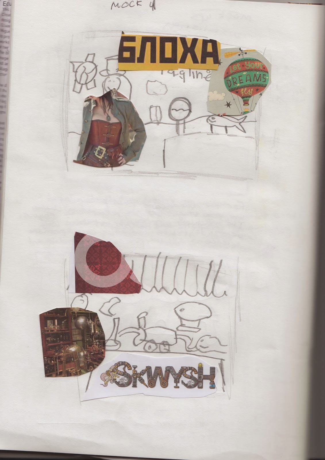
General scientific tag lines were written into my sketch book in order to get basic ideas out of my head. I admit these were not good but I kept them as reference when I developed more persuasive one liners.
 For the second lot of tag lines, I included many emotions and themes into their meanings. My main idea at that moment was alerting student particularly females that no science would cause the world to die. I created tag lines like No science, no life, Become the savior for billion.s I had other ideas that tried to make the poster funny but I did not work because they turned out to be patronising and out right ridulus.
After the presentation, I developed 3 more better and more catchy taglines inspired by one liners used by top companies. I still have the cure theme but a the wording is different to make the message sound catchy. There is other messages to students that suggests that science has interesting experiments, therefore they should join the courses. Here is a list:

Colour

1st
My first idea of a colour scheme included brown and white to make the poster feel mechanical and Victorian. I was inspired by this colour scheme because the light brown, which represents the highlights, would give the imagery greater depth. The use of a light source would allow the central image to become the main focal point. In addition applying brown on a white background would create a large contrast of colours, making the imagery(the scientist) stand out.2nd
This colour palette was selected if I was going towards a very artistic path. There is an artist called Byan Keystone who creates images using Illustrator that look hand drawn. His image on the colour mind map features colours associated with old paper like yellow and white.The most powerful thing is the consistency of the colour. Rather than use blue, purple and other vibrant colours, the artist uses darker colours that are similar to yellow, such as dark orange, brown and red. I was inspired by this because I thought that the colours complimented each other to create the old paper effect and look easy on the eye.
3rd
For my third option, I decided to include a vibrant colour scheme as a possible choice. I was inspired by the background colour because the light blue makes the artist work come across as calm and clean. Due to the brightness of the colour, this would enable my illustrations, such as the female scientist, the experiments and the animals, featuring darker and striking colours like red and black to stand out. This would therefore would make the key points of joining science being noticeable to the target audience, female and male college students.
4th
The last image caught my attention because the colour scheme is associated with the images from a famous game called Bioshock- Infinite. The colours featured in the graphics blends well with Victorian style of fashion. This may be a possible choice because the brown symbolises leather, a characteristic of steampunk imagery. The use of leather would make the female scientist's clothes look unique, therefore, it would stand out. Due to the high contrast, putting gold on brown would cause he metal objects and the lighting effects in the design to be noticeable. Chosen choice
After experimenting with the colour choices, I made a decision to include colours from image number 3 and 4. I found that the colours featured in balloon image would not be enough for the female scientist to become focal point due to the brown having green tint. There is also a lack of yellow and orange for the metal objects to appear as effective foreground objects. To solve this problem, I have included the brown and gold from image showing the woman posing. The use of brown on clothing and gold as primary colour for the metal pipes and objects would make the poster design look more dynamic, which would make the poster more appealing to students at college.purpose
Blue: background
Green: for the jacket
White: clouds and certain parts of the clothes
Red: The equipment relating to science, like the heart. Certain parts of the text to compel audience to read the tagline.
Brown: Leather, Shadows and the hat
Gold: For the metal pipes, cogs and wheels
Sketches


The overall sketches that I came up with was the scientific equipment relating to general science topic. I came drew objects that are associated with a science lab, light light bulbs and goggles. This page features imagery that would most likely appear as background images to make the poster look captivating. This would include light bulbs that will create great lighting effects in order the central image, the woman, the main focal point.
With biology, I came up with mechanical hearts with wheels and cogs. This was inspired by a steampunk artist that produce a drawing of an android or a cyborg filled with cogs. This comes across as un-real and strange to the audience. If I develop this idea, I want to the use world would die without science theme in order to persuade female students to take science to save the world of tomorrow.

This section contains more machines that are associated with science. One of my favourite type of steampunk imagery is the use of unusual designed balloons. The use of type of graphic make the imagery look quirky and imaginative therefore it would most likely appeal to the younger audience. Applying drawings that are colourful on the background will make the design look very dynamic and vibrant and therefore it will male and particularly female students.
In order to meet the standards of the brief, I will include a woman as the main focal point. This female is a scientist who is performing a life changing experiment to benefit mankindl This will show that science is a great place to expl which show that woman are capable to be good at science as male. This promotes equality to female students because a sign of strength shows people they can achieve anything if they are willing to contribute.
This is another sketch-board that focuses on biology. To create an imaginative poster, I came up with concepts with animals with cybernetic parts. An idea that I just came up with is a female scientist treating animals to help the world operate. My overall message I would like to convey is the idea biology dying I would cause the animals to become extinct.


As for the sketches above, I have drawn symbols relating to science like observatories and dna icons to make the themes of the poster obvious.

These two page show more inspirations and Steampunk elements should be included into the final design. The main ideas consist of cogs, wheels and typography that feature a curve. At this point I aimed to base to have a busy background featuring a lab to ensure that a science environment comes across as interesting. As for the typography, intended to influence my design on the posters featured on Bioshock. I released that the primary reason why I was captivated by the text is because poster uses a arc shape path to position the letters. The use of a large curve on the typography compelled my eyes to read the entire text. At the time, I thought this feature alone would allow the tagline to be very noticeable.
References
http://www.nirahlee.com/iswwr/index.php?option=com_content&task=view&id=50&Itemid=32
http://pgiw.wordpress.com/2011/11/13/recruitment-advertising-tactics-in-ww1-patriotism-or-a-white-feather/
http://pgiw.wordpress.com/2011/11/13/recruitment-advertising-tactics-in-ww1-patriotism-or-a-white-feather/
http://www.crestock.com/blog/design/the-evolution-of-propaganda-design-us-retro-posters-122.aspx
http://www.crestock.com/blog/design/the-evolution-of-propaganda-design-us-retro-posters-122.aspx
http://blog.forces-war-records.co.uk/2013/02/06/war-poster-wednesday-wwi-recruitment/
http://www.smashingmagazine.com/2009/06/08/retro-futurism-at-its-best-designs-and-tutorials/
http://www.karinlocke.com/blog/tag/steampunk
http://steampunk.wonderhowto.com/inspiration/cure-all-your-ills-or-give-yourself-some-new-ones-with-steampunk-medicine-0144559/
http://www.smashingmagazine.com/2009/06/08/retro-futurism-at-its-best-designs-and-tutorials/
http://www.karinlocke.com/blog/tag/steampunk
http://steampunk.wonderhowto.com/inspiration/cure-all-your-ills-or-give-yourself-some-new-ones-with-steampunk-medicine-0144559/
http://formandreform.com/wordpress/?p=3434
http://designspiration.net/tag/steampunk/
http://www.pcgamer.com/2012/12/08/what-i-didnt-love-about-bioshock-infinite/
http://owendavey.blogspot.co.uk/2011/08/in-my-good-books.html
http://designspiration.net/tag/steampunk/
http://www.pcgamer.com/2012/12/08/what-i-didnt-love-about-bioshock-infinite/
http://owendavey.blogspot.co.uk/2011/08/in-my-good-books.html
No comments:
Post a Comment