This blog's purpose is to explore diegetic sounds and how can they be used in my final design. I will also provide more time based media events to get more inspiration.
Diegetic sounds are visible on the screen and is caused by a source who is present. They are used to allow someone to tell a visual story. Examples of this are people speaking, objects being banged and music being played by instruments. Having the volume and clarity being reduced is one fundamental principle of this sound type.
In contrast to this category of sound, non-diegetic sounds are noises that are invisible and there is nothing to cause the sound to occur. In other words, there are no indexical signifiers. This ranges from narrator to a soundtrack. They are usually applied in the editing stage. Let find some of examples of this that are relevant to my video.
Non diegetic sounds
Gawper from A Large Evil Corporation on Vimeo.
SPOV 2012 Reel: Score and Sound from Zelig Sound: Composition & Sound on Vimeo.
This music trailer or video signify what they studio does. The arbitrary signs at the outro applies that it specialises in composition and and sound .
This is a great video that uses non-dieetic sound to represent the sense of movement and kinetic energy. At the 0.04-0.06 there are so many edits that is caused by the camera zooming out. The 4th second only reveals the man but it later shows many buildings. Suddenly there are 3 edits showing the graphical elements moving. In my opinion, this acts as some kind of transition because the 3 edits are very short and leads to a longer scene. The effect in the transition is successfully implemented because the loud audio corresponds with the edits. The boom also can be heard when the camera shivers or looks jarring.
There are 10 edits within the 10 to 15 seconds time range. This comes as a jarring and the very quick to the human eye. However, utilising in applying intimidating music it makes look relevant to the trailer.
Interface or science fiction sounds compliments the Iron Man Interface style. There are beeps accompanying the graphical elements. They can be heard when they appear.
This is a motion graphics video that incorporates organic sounds with digital animation. This aims to elaborate. Semblance is the key word that CJ Cook uses in the description.
This is a great example of clip using non - diegetic sound that increases the sound effects. The clip is directed by David Parker. The dark, silent and eery soundtrack was added in production stage. Having the music accompanying the dark setting creates a quite scary feeling. The volume and the eery audio compliments the lightbulb sound.
The audio is quiet enough to allow the audience to hear other sounds. The combination of both the audio and the clip conveys a feeling of isolation.
The use of the slow motion effect makes the audio correspond with the clip. The pace of music is slow, therefore, it enables the slow motion glowing object have Cameras capable of recording at a high frame rate must have been used in production.
Although the pace of this will be faster in my video, having intimidating non - diegetic sounds would portrays my journey to recording sound very dark.
Light from Sunday Paper on Vimeo.
Contrast from CJ Cook on Vimeo.
This is a moiton graphics video that incorporates organic sounds with digital animation. This aims to elaborate the organic feel whist com positioning it in a digital environment. Semblance is the key word that CJ Cook uses in the description.
The use of exaggerated non- diegetic sounds is a great characteristic that increase the the effect of the movement. There are 6 edits where there is a dual screen presenting a contrast between hate and love. Sound from a library or a royalty free website is most likely used in these scenes. The use of the non-diegetic audio of slap paints a picture that the woman slapped the woman really hard whilst the love clip uses a comical kiss sound.
Another great attribute this video offers is use of human sounds rather real audio. The sound of the a male staying bing as the spoon crashes the potato creates a organic feelingThis feature makes the scene come across as comical and maybe strange.
Although the idea does not reflect my potential product, producing noises using my voice could be a possibility.
http://vimeo.com/34949030
http://vimeo.com/28685926
http://vimeo.com/40257810
http://vimeo.com/29368401
Wednesday, 29 January 2014
Research and more storyboards
Due to the time constraints, the research into clips and movie had to be conducted. Go Pro was the immediate thing in order to get inspiration. Go Pro clips are about a minute long but they have a great number of edits the maintains the excitement. I concluded that many of the clips use many effects and non diegetic sounds, such as the narrator. I also think that they do not provide kinetic energy because they only use the professional way of filming.
I then found examples of intense examples of short advertisements. This gave me the insight of the length of the scenes due to the high use of edits. Battlefield 4 is a great example of this. I also deliberately searched for adverts running on a slow pace. This offered me a great contrast between fast and slow. However, I am continuing with getting more examples to get more inspiration.
I searched and analysed a group of intense scenes from movies. One of the most inspirational ones was the Matrix's Reload car scenes. As mention in the car scene post, I positively commented how the edits flow and how they use movement to make the scene look intense. The car scene in Too Fast Too Furious is a great examples of camera perspectives.
To provide a wider scope, I analysed the Odessa Steps, 1920's German horror movies and Charles Dickens Great Expectations. I concluded that the lighting effects and the perspectives create the disturbing feel. Being inspired by this feel caused to use lighting effects in my clip
As for the sound, I analysed the audio used on the examples.
After I done the research, I sketched my general storyboards, I used the storyboard with the 6 ox. This was used for the other ideas in a desperate attempt to get a clearer image in my brain. However, I realised this was not going to work. For my chosen the idea I wanted to focus on, I only had two boxes to ensure that I drew the most effective and precise images. To plan the lighting effect, I chosen to use red as the highlights and the black as the shades.
The final storyboard displays real photos to give my head a clear image of the sequence. The photos include me preparing and doing the voice over. I went into detail about the lighting, effects, the elements, the edit number and the best of all the second mark.
As a result of the feedback, I need to refer back to the storyboard and apply some edits.
With that over please navigate to the sound page.
My journey and Final idea
With the storyboards mostly finished, and the feedback given, I just as well provide a proposal on the final design. The content of the video is based on effects and camera views used by Go Pro, short advertisements and movies. I will do a post about the product's audio as I need more inspiration and research.
The process
Rather than use a general brainstorm, I categorised ideas to make a clearer understanding. There were 3 groups: 10 minutes, 20 minutes and 30 minutes. I generally put a keyword into the groups, such as food, going out and among other things. I generated cooking based ideas for food. Examples of this were, cooking a cake with a twist and producing bread that goes wrong. The issue with these ideas was the fact that it can be expensive and it has been done by many video artist.
I was generating dull ideas for the 20 minutes but with 30 minutes, it was another story. One idea I brainstormed the was the voice over. This concept stood out in my mind because it is one of my favourite hobbies. This would represent time based media because completing a voice over takes about 40 minutes, including setting up and production
Showing enough captivating process of the process was the next problem. The solution for this is to list many possible scenes as possible. The rule I had was that if the clips does not have 30 ideas, do not use it. However, I was able to throughly list the preparation and the production aspect of the video. I also developed two ideas to see whether they would work.
The next process of the pre production was drawing out the setting and the concepts. To ensure that the most relevant setting is used in the video, I drew 3 rooms in my house. The lighting in kitchen, the hallway and the bedroom caused them to be the locations of my clip. The hallway is a great location because I can experiment with aerial and high camera views. My staircase is quite weak, making a creaking noise. This would enable me to use exaggerated sounds that have the organic feel.
With the setting and idea, there must be a general story board. I developed a story board with 6 scenes to generally get the idea. Stickmen were not used because the unclearly make references. I repeated the process with the other ideas.
Please follow me onto the research, storyboards and justification
Presentation review
Overall there presentation was praised for having a unique way of pitching a story. I used real images to present my final storyboards. I thought this method would enable me to get the most essiental feedback given by my peers. It was applied that many of my peers thought that it is a good idea that is relevant and is very achievable.
As for my inspirations, showing the examples ranging from Great Expectations to Go Pro videos demonstrates that have conducted a lot of effort researching into adverts, short clips and movies. Overall the pace of this section felt very slow. However, it was necessary to show them to show the theme and the characteristics of my video.
Overall the suggestions given was to apply a psychologically aspect to the video. To achieve this, I must use a lot of dygetic sounds, such as loud footsteps and breathing. Presenting great expectations as my example enabled a peer to suggest to add lighting effects that change the mood of the overall environment.
Although I stated that the voice over idea only idea that I wanted to developed, I should have provided a diagram showing the why.
For my final idea, I am going to apply a dark environment to the stage. There is a possibility that black and white filters will be added to provide an intimidating feel. To add some contrast, I will make the second half of the clip have colour. A more detailed post on my final design will published today.
From this point, I am going to sketch a range of ideas to achieve the psychological feel. This needs to be applied because having the use to sounds only will not make a bold impact. With my blog, I am continuing to conduct research into adverts, sounds and inspirational clips.
The rating of my prevent is as follows
Theme: 9/10
Pace: 8/10
Um and you knows: 7/10
Text per slide: 10/10
Clear and logical path: 9/10
Sunday, 26 January 2014
Effects and outro

One of the main effects I aimed to achieved is the ground shaking. Scenes with dropping items on a table, such as the glass of water, would benefit from having an earth quake effect. To achieve this, I must experiment on motion and get copyright earth textures. The point of this effect is to create an indexical signifiers that highly exaggerates the signified To achieve this, I must create the animation on Motion.
I have seen many radio adverts on the BBC with the old film effect that conveys a vintage feel. The effect will most likely be overlayed the voice over section of the clip. The plan is to make it appear when the count down starts. The clip showing the program and myself speaking will have this effect in order to enhance the overall feel. The aim for this symbolic signifier is to connote that it is a very creative and energetic process. I will play with additive colours yellow, blue and red to create effective sun light. It will also achieve a great contrast between dull and vibrant.
Some images below have perspectives I was inspired due to the unusual angle. This attribute would increase the appeal of the scenes.

The most appropriate solution for producing a 3 second outro sequence is just make the text appear and move. However, the scene should have an iconic signifier to accompany the text. Applying this would enable the tagline to signify a meaning to the audience.
An outro must contain a captivating graphic style. Luboš Volkov is a graphic designer who has produced very symbolic computer icons. In contrast to the black, the final design will feature Hex: eb4c14(organge hue with red) as the outline, f5dfb9 (tinted orange) as the background and 90c3b6 for the internal lines(green/blue). On a tint orange background the blue and orange elements would appear as saturated. This is a great colour scheme because the strong colours makes the icons the main focal point.
Friday, 24 January 2014
Decision
At this time, I am creating the final storyboards for my assignment. I edging to produce a time based video about preparing and doing a voice over. This is my chosen idea because it takes more than half an hour to complete the process. This includes getting water, logging on, prepare the microphone, close the door, change the preferences, record, applying effects and then export.
The aim of this story is to protray doing voice over as partly serious, enjoying and energetic. To create a contrast to enjoy and a captivating video, a cliffhanger showing me getting frustrated by the exporting function not function might get included but this will depend on the amount of time the other scene consumes.
I originally intended to produce a comical based video about cooking a cake. The only that concerned me is that the ending scene would show me dropping the cake. However, this would apply I would need to purchase more than one cake to show different camera views and if anything goes wrong. However, by tonight if I do find a solution it most likely be the no 1 candidate.
Going to the cafe idea was another concept but had to be scrapted. This was due inability of getting more than one person to film the project. Although I would enjoy producing this video, I am concern that people and places may not tolerate this as well.
An outro would a great idea that would enable me point out the moral of the video( the connotation). With the audio recording video, the outro scene would reveal words like prepare, record and export to right format or check before export. I will need to brainstorm ideas and effect created in either After Effects or Motion. This blog will cover the disadvantages of using After Effects.
Manga: Great perspective
As for getting ideas about facial expressions and camera perspective, Manga is the best candidate for those inspirations.
One of the most unique Manga with great use of perspective to enhance the story is the DBZ. DBZ is a one of the most famous Japanese Anime and Manga brands of all time. It was produced by by Akira Toriyam and published on the Weekly Shōnen Jump between t1988 to 1995. Its comic features many fight scenes, blood and love scene. This applies that the comic is an fighting and adventure comic. All of the iconic signifiers would most likely appeal to people in the 10 to 20 age demographic. This genre of comic usually have these traits.
Blood connotes that the comic is violent and has threatening characters. The fights applies that there are many cases that there are villains vs heroes type of scenario.
As for the technique, the Manga must have been drawn by many artist. Drawing detailed environments and characters consumes time. The cost of printing must have been high due to the large quantity of volumes.
Lets talk about the examples of pages to demonstrate inspirations are very useful.
View:
Close shot
Eye view
Long shot
 The image on the right features an intimidating man approaching another character. The close enables his mood to be convey efficiently. The blood marks of his face are very noticeable due to the distance of the camera. The eyes and mouth are very bold things that improves the atmosphere. As Manga reads from right to left, the following picture reveals the cause of indexical signifier. There is a shot of another character who glaring at the smaller character. The pace of the scene is very fast due to the fact that the page immediately only shows the smaller character. Signifiers, like electric, demonstrates that effects increase the intenseness of the situation. I like the idea that there is tension in the design. Having rocks flying, electricity and ripped clothes demonstrates that this person is really powerful
 Compared to the previous image, this part of the story offers a great sense of movement. The first picture reveals a behind shot of the flying character approaching his adversary. Straight, thin lines represent a sense of movement in comics. However, many real clips use blurs to create illusions that people are traveling at a fast speed. The next shows a good perspective of the man whom the flying character is fight attempting to punch. The distance of the camera and the fist is quite close, making it look striking to the audience.
 This is another great example of a fight scene. The sequence reveals the fight from different perspectives that maintains the audiences' interest. The first scene shows a side view of the scene and then the following picture reveals it from behind the woman. The last and the narrow picture shows a front close shot of the woman preparing for another punch. The use of different perspective signifies the characters are fighting at a fast pace.
Planning is one technique is a common trait feature on all scenes. Choosing the best angel and scene narrative takes a long time. They all demonstrate that the artist and writer have collaborated to create effective scenes. Although this is in a different medium, it is a great inspiration for effects and perspectives to create a captivating time based event.
References.
http://www.mangapark.com/manga/dbz
http://en.wikipedia.org/wiki/Dragon_Ball_Z
One of the most unique Manga with great use of perspective to enhance the story is the DBZ. DBZ is a one of the most famous Japanese Anime and Manga brands of all time. It was produced by by Akira Toriyam and published on the Weekly Shōnen Jump between t1988 to 1995. Its comic features many fight scenes, blood and love scene. This applies that the comic is an fighting and adventure comic. All of the iconic signifiers would most likely appeal to people in the 10 to 20 age demographic. This genre of comic usually have these traits.
Blood connotes that the comic is violent and has threatening characters. The fights applies that there are many cases that there are villains vs heroes type of scenario.
As for the technique, the Manga must have been drawn by many artist. Drawing detailed environments and characters consumes time. The cost of printing must have been high due to the large quantity of volumes.
Lets talk about the examples of pages to demonstrate inspirations are very useful.
View:
Close shot
Eye view
Long shot
Planning is one technique is a common trait feature on all scenes. Choosing the best angel and scene narrative takes a long time. They all demonstrate that the artist and writer have collaborated to create effective scenes. Although this is in a different medium, it is a great inspiration for effects and perspectives to create a captivating time based event.
References.
http://www.mangapark.com/manga/dbz
http://en.wikipedia.org/wiki/Dragon_Ball_Z
Tuesday, 21 January 2014
Great Expectations
Charles Dickens’ Great Expectations shows very sophisticated edits that makes the first scene stand out. The use of one edit for the first 20 seconds creates a slow pace. As soon the scene fades out, the page turns 6 times, therefore, this is considered as six edits.
There is a memorial long shot clip of the boy running in a isolated countryside. The movement of the camera is very smooth. This connotes that specialist equipment, such as tripod, was used to carry the camera. At the 0:40 point, the scale of the boy become larger. This clip itself feels intimidating because the pool iconic symbolises death. The wooden structures resemble the gallows. This applies that many executions have taken place.
Another great shot is the church graveyard. The minute mark reveals boy standing in the graveyard with this massive church in the background. The lighting effects enables the church to be the main focal point. Although the low of number of edits could make people loose interest, the length of the scenes are consistent and enables the view to take the imagery all in. The low angle view exaggerates the church's scale, allowing it to strike the audience.
Overall The Great Expectations runs on a slow pace but it benefits the suspense and the atmosphere. Although I will use more edits than this entire clip, I think that the camera perspective is important role in creating a captivating design.
In semiotics, the clips itself is a great introduction for a story featuring boy living in the countryside. In this clip, we iconic signifiers, a book, countryside, church and the gallows. At the use of the fade in effect and book tell applies that the book was written by the boy. As mentioned the running scene shows the gallows, connoting that deaths have occurred in the location.
Sergei Eisenstine
His is infamously known for directing Battleship Potemkin in 1925 and Silent Films Strike in 1924. He is associated with the movie studio, Mosfilm. The film studio is among the oldest movie publishers in Russia and Europe. It has exported acclaimed Soviet Union propaganda movies.
 Battleship Potemkin demonstrate his style of directing. His feel was well known for providing emotional scenes that the audience would respond to and feel sympathy to the rebellious sailors. Although this received mixed receive by the Russian , the international audiences complimented this. During the period of the Nazi’s being in government, Joseph Goebbels praised the movie but stated that people ‘without political conviction’ could become a communist or Bolshevik. Although the movie was not banned, Himmler forbidden the SS members from watching it.
 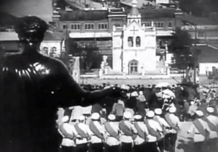 Let’s take the famous Odessa steps scene. After the title sequence at 0:45, the next edit revealed frightened people running down the steps. In my opinion, the scene at 0:54 is the most emotional scene. There is a disabled person attempting to run. This would most likely to cause people to feel sympathy. However, the signified of the iconic signifier is revealed at 0:59 where solders are carrying guns.
The masse cure starts at 1:25 point. This scene reveals a few people falling backwards, signifying that they have been shot. To how close the threat is, a cut is made to show the villains walking down the stairs and then a scene of people running appears at 1:30.
Monday, 20 January 2014
German Movies 1920's
The next thing I will conduct research on is lighting effects and crazy concepts. One of the famous genre of movies who feature this characteristic is 1920’s German movies.
 There is a 1920’s German horror movie called Genuine. This is an usual movie because the clips use many hues rather than black and white. One of the most noticeable scenes in the entire movie is the woman moving strangely but elegantly moving in the hairdresser. On 23:56, the black background and the lighting makes her look something out of the world of imagination. The number of cuts is low because her body movement is slow. This enables the clip to show that she signifies something strange.
On 24:12, the main focal point is the man’s facial expression.The hairdresser has an unfamiliar suit and hair style. To audiences, such as myself, this comes across as eccentric but people living in the 1920’s would have found this usual to watch movies with this characteristic. The light also reflects on his skin, creating more contrast between the shadows and the highlights areas. This causes his face to be very noticeable. I realised that there is shadow surrounding the clip, making it stand out.

The overall clips gives a disturbing impression. The sound of a strange soundtrack and the fascinating scenes entices me to get influenced by this style. Although I cannot use one soundtrack on the video, it is a great idea to play with the audio. Maybe I would use my own sounds rather than use somebody else’s work.
Lets talk about the technique, Ica and VP-Ensign are among of camera that may have been used for production. Very old recorders must be used to record the music and then insert it into the silent movie.
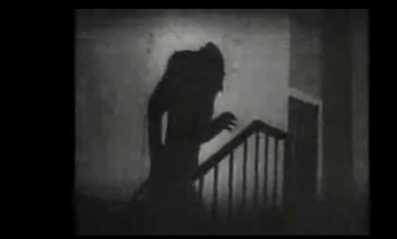 The main thing I want to focus on this research is the theme and the shadows. The most frightening and iconic scene is the shadow clip at 0:28 until 0:34. Having the light source reflecting on the wall causes the shadow to stand out. The scene is quite imitating because the black and white colour scheme, the loud audio and best of all the unclear indexical signifier. The connection of the indexical signifier and what it signifies is unclear because there is no visible human or object causing the shadow to appear.
In semiotics, a shadow immediately symbolises a horror movie. As mentioned on the previous paragraph, the shadow is an indexical signifier that has a blurry connection with it signifies. This invisible phenomenon is either a ghost or an illusion.
To achieve this effect, the lighting had to be very bright. It is most likely that the lights with large lamps and stand were used in this production.
Chase and fast scenes
Matrix Reloaded.
One of the things I will mainly consider using in my video is the use of action sequences that would make a normal activity, such as making a cup of coffee look very intended.


The first thing associated with fast scene were fights. One of the most famous fight scenes appears in Matrix Reloaded. Lets go through what the infamous action sequence offers.
From 0:01 to 0:03, the scenes reveals a villain shooting at a car. The most interesting aspect of the scene is after the second cut. The following scene shows the shooter’s perspective of shooting. As it turns out, he is trying to destroy the car. There are many behind and mid shots.


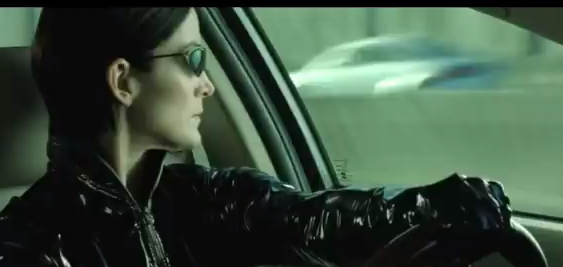 The scenes in the 0:03 to 0:14 features a large number of edits. The great use of cuts in the cars creates a flow and maintains the excitement. The most noticeable thing about the scene is when a edit is made as the woman turns her head. The following scene shows a slow motion clips of car flying in the air. There are 4 edits that show different perspectives of the scene, including an Aerial view and a low angle shot.

Another great scene is when the ghost enters the car at 0:26. An edit is made when a character in the cars move or dramatic events occurs. The camera focuses on the bold headed guy as he points a gun. After the gun is dropped , the camera reveals the gun’s destination. This is a great example to get inspiration from videos with loads of edits. The pace is maintained due to the use of very close shots.
Effects enhances the overall action sequence. The use of using fast motion effect on the person standing on the roof produces an interesting effect(1:46). As the person dodges the gun shot, there are duplicates of him.
This a clip of a movie that appeals to the younger audience.


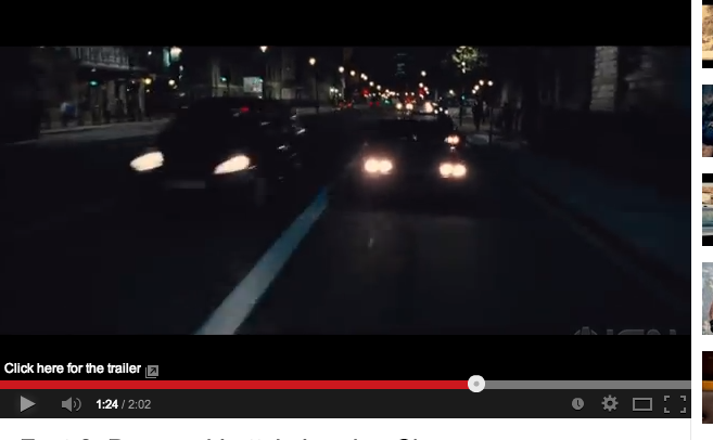
Although I am not a great fan of Too Fast and Furious, there are racing scenes are very captivating. The ready scene has the most effective edits. After the woman shouts out ready, suddenly a woman inside a car appears. After she says ready, suddenly there is loud racket of a car engine preparing to travel at fast speed. The scene is believable because the sound is accompanied by speedometer showing a high figure. The scene is fast enough for it to build the action.

Another great aspect of the clip is used of sound and lighting effects. The brightness of the car lights strikes the audiences’ eyes, allowing the scene to maintain its appeal.
 The 1:12 to the end of the video is main focal point of this video is the race scene. I realised the edit occurs at 1 or 2 seconds. This characteristic conveys the racing theme and excitement of racing at a fast speed. An edit occurs when the cars turn, increase their speed or when the person is changing gears. This signifies that racing is intense and fast experience. This reinforces the movies title.
 In order to produce this one of a kind clip, cameras costing over 1000 pounds minimum must have be positioned on fast production vehicles. The speed of the car applies that the camera is able to detect fast traveling objects. Having so many edits would suggest that the recording the entire clip must have taken 1-3 days. Storyboard must have been used to plan the entire sequence.
 Although doing this type of thing would be impossible for me. However, applying this concept to a everyday activating would captivate my audience.
Unlike the previous examples, this is less jarring due to the use of cross cut. Two different perspectives, the woman and the man, are presented to give a intense feel.
Short advertisements

This a very intense 30 second advert that promote a popular game Battlefield 4. The first thing I realised with the video is the use of arbitrary signifiers, the publisher and the developer. The use of striking music and transitions makes the brands and the intro noticeable.
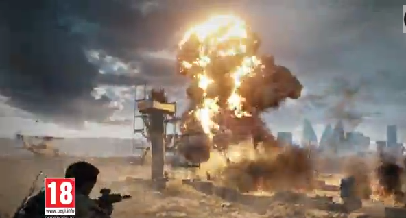 As for the other parts, guns, military equipment and action sequences signifier war. On denotation level this is a game with war. The only people who would appeal to this advert are Battlefield customers and general gamers. The explosive scene applies that this game is action orientated. The use of these scenes would make some people feel intensed.
The production of this trailer must have been time consuming and expensive. Getting the copyright for playing one of Rihanna’s songs as the audio must have cost them around £3000. This is based on my research on previous projects.
Moving onto the clip and camera, there are 35 edits within the 30 seconds. The intro has 2 edits with very striking transitions. This a great introduction because it immediately brings my attention of what the trailer is promoting.


For the remaining parts of the clip, the intensity of the scene changes from 2 seconds onwards is very fast. The edits correspond to the dramatic events and action, such as the man grabbing the gun from the other man. Many of the shots show the scene from the characters' point of view, It only last on 2 for two seconds. The gun scene is very effective because after the man gives the gun, the scenes changes and the movie then reveals the man going to shot the window. This brings a continuous path for the audience experience that is not jarring and not captivating. Another great examples of appropriate use of edit change is the people running from gunshots. As the man gets too close to the camera (close shot), the scene showing a different perspective of the action scene appears.
On the interesting note, there are 3 edits with fade in transitions at the 20 second mark. This is great effort of presenting the game’s environments. Suddenly at 23 seconds, title sequences interrupts its and then it is followed by a 1 second game play clip. This fast sequence is repeated many times, resulting a large number of edits to appear within 6 seconds.
 |
| Although it is not clear, the clip is accompanied by a striking transition |
The some of the fast edits have very striking transitions, making it jarring. However, the pace and the use of mixture long shot and point of view keeps the video captivating.

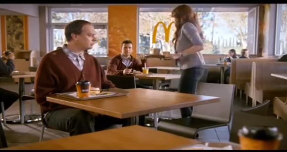
 This is advert promoting food at fast food retail chain. This clip shows a McDonald store containing people having their breakfast. Immediately the viewer is forced to look at the iconic signifier, the Mcmuffin. When the woman enters the screen, there is one of the most symbolic signifier in the world, the McDonald’s logo. Majority of the scene show the logo in the background to get that this is an McDonald’s advert in their heads.
The overall feel of the advert is comical. After the woman realises that she sitting with a stranger, not her boyfriend, she immediately finds her boyfriend.
 For the production many camera men and light equipment were used create a visual pleasing clips. They might have recorded about 1-3 hours worth of video content to ensure there is enough clips to inserting into the editing software.
Lets talk about the small number of edits within the McDonald’s advert. Unlike Battlefields advert, the scene length for this longer, making it less exciting. With less scene changes, there is a possibility that people would most likely to loose interest.
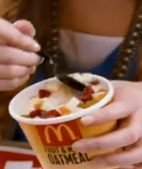
This shows the audience a second person’s view of 2 people having a meal. For the first 5 seconds, the camera reveals a close shot of a man eating a burger. Behind is a blurry background that makes him the main focal point. The camera changes just before she sits down. I realized that the edit on 0:04 is important because the following scene shows more products and the brand logo. The close shot of her scooping up the ice cream appears at the 7 second mark. The positioning of the logo on the ice cream container causes the logo to strike the viewer. Another edit appears when she eats the food, creating a good flow.
Another great feature of the advert when is the use of edits when a person is eating or speaking. At the 0:11, the man is moving his forward but when he eats it, a clip revealing him eating the cream from the font appears.
 Overall, this advert features a great theme but does not contain enough edits to maintain the audiences’ attention. The reason why I conducted research on slow clips is to ensure that I know what not to do with a short clip with many edits. However, if dialog is used, I will explore the comedy theme.
Overall, the advert consists of mid shots. This is to allow the audience to see enough of the scenery(the resturant).

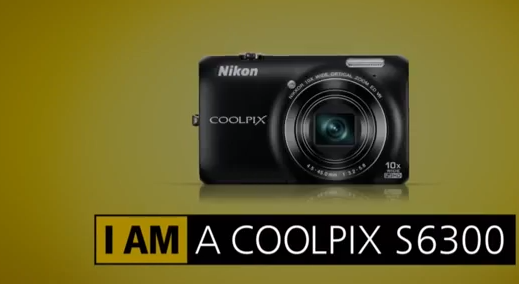
This is a Nikon advert promoting its camera range. The main element that signifies that their camera a great quality is the clips. Many of the clips are very vibrant and very clear. A great example of this is the shark scene. There is a high contrast and great lighting effects that represents the high quality of Nikon footage.

 Unlike the previous examples the arbitrary signifier, the text, are also iconic. In the lot of scene, there is a girl resting. A text sequence showing a pun, ‘I am recharging’ that represents the feeling of resting. With the animation it connotes that the camera charges at a fast rate.
Another great signifier is the man moving his camera in an urban environment. This clip signifies that moving the camera would not ruin the quality and maintains the high frame rate. The use of a low angle shot and a eye view is an interesting shot. Swinging it around offers a great sense of movement.
 Overall the audio is symbolic and iconic because there is no clear connection between the audio and the brand. However, many people may have heard this song on another Nikon advert, making it iconic. Whether it is royalty free music and produced by their talent, they have must used Audio editing software, like Adobe Audition, to achieve a great and high quality song.
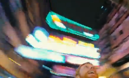
 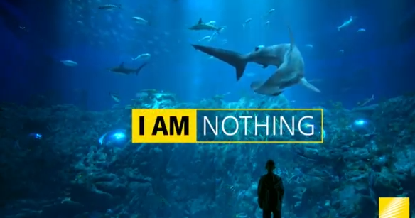 The clip at 0:20 is great effect that people would most likely remember. The scene is unfocused and is zoomed in but it become clearer when the camera focuses on the lights. This is an interesting effect that is commonly used by professional editors of adverts and movies.
The footage is perfect example that demonstrates that edit can be a new object or element appear on the screen. After the second edit, text appears on the image. The then suddenly reveals animation, which is considered as an edit. The use of animated text is used on the following times: 0:12 and 0:22. Afterwards, there are 2 edits appear on screen; the appearance of text and the camera. This repeats itself many times by the colour the camera constantly changing and the text revealing the name of the model. This makes the last seconds of the trailer look interesting.
Subscribe to:
Posts (Atom)