
One of the main effects I aimed to achieved is the ground shaking. Scenes with dropping items on a table, such as the glass of water, would benefit from having an earth quake effect. To achieve this, I must experiment on motion and get copyright earth textures. The point of this effect is to create an indexical signifiers that highly exaggerates the signified To achieve this, I must create the animation on Motion.
I have seen many radio adverts on the BBC with the old film effect that conveys a vintage feel. The effect will most likely be overlayed the voice over section of the clip. The plan is to make it appear when the count down starts. The clip showing the program and myself speaking will have this effect in order to enhance the overall feel. The aim for this symbolic signifier is to connote that it is a very creative and energetic process. I will play with additive colours yellow, blue and red to create effective sun light. It will also achieve a great contrast between dull and vibrant.
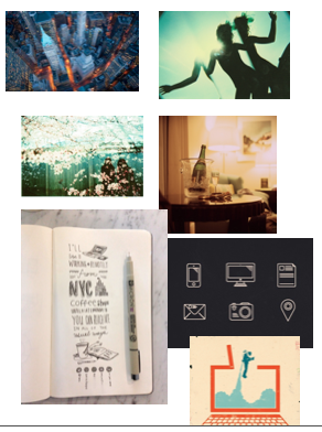
Some images below have perspectives I was inspired due to the unusual angle. This attribute would increase the appeal of the scenes.
The most appropriate solution for producing a 3 second outro sequence is just make the text appear and move. However, the scene should have an iconic signifier to accompany the text. Applying this would enable the tagline to signify a meaning to the audience.
An outro must contain a captivating graphic style. Luboš Volkov is a graphic designer who has produced very symbolic computer icons. In contrast to the black, the final design will feature Hex: eb4c14(organge hue with red) as the outline, f5dfb9 (tinted orange) as the background and 90c3b6 for the internal lines(green/blue). On a tint orange background the blue and orange elements would appear as saturated. This is a great colour scheme because the strong colours makes the icons the main focal point.
No comments:
Post a Comment