Friday, 6 June 2014

Logging of code

Learning code

One of the things I have learned on this project is to make-sure that the plugins or code are necessary for the user to experience. Using many plugins on CodeDrops could have made me lazy in terms of writing code. I managed to learn new code by watching You Tube videos. I was able to understand the overall code due to the presenter talking about the instructions and code. Understanding the syntax rather than placing a plugin improve my learning. A slider plugin was used but I watched a simple tutorial discussing about the code required to create the interactive element.  Due to fast approaching deadlines, I realised that coding a error free image gallery would have been impossible. However, I managed to separate the code into small parts to understand the CSS.
CSS3 code

Generally, CSS3 has prevented me from using image swap. The issue with image swap is the increase of bandwidth. The browsers has to make more hits to display the image, making uploading process a lot longer. In the late production stage, I realised that there a webkit feature known as filters. There are wide range of websites offering tutorials on how to apply them on websites. I studied the code on a couple of website before using it. Using RGB as a colour format instead Hex is a key component of this code. Experimenting with the code caused me to conclude changing the opacity and alpha channels for the RGB colours makes this colour format more flexible than the Hex pallet. 

website blogging

 CSS and HTMl Validator


I have now the experience of making-sure that my HTML and CSS files have no syntax errors. The code from all documents were placed inside a validator input to help me with an issue. W3 revealed that there were typographic errors in my layout css. Using CMD J to quickly find the line where the mistakes is located.


I reinserted my CSS code until there was not any errors on W3's website. Correcting the mistakes resulted in a well-done message appearing on a site. The code below allows me to place a W3 CSS3 tested  certificate onto my website. Adding this symbol will signify to users that this site is trustworthy. Trustworthy is a key aspect of user experience design that web developers should consider when in the planning and production stage. 


However, validator has a problem at recognising figure caption and CSS3 functions. Even though captions are new tags, validator do not recognise them. Webfilters are other properties that validators have struggle to recognise.  However, I have attempted to correct many errors as possible.  It may appear that have more errors than usual. 

Z-index


A confliction between the navigation bar and SVG logos caused me to explore the Z-index. The SVG logos appeared a front of the fixed navigation links. W3schools points out that the z-index function arrange the graphical elements into layers resembling the ones used in Photoshop. The graphical element with the highest value appears on the top layer.  With my experience with CSS, I set the z-index at 100 for the navigation whilst 99 for the SVG logos. At first, I thought that this solution may not work due to my lack of experience using this specific code but the website was seen on browsers, the confliction disappeared. This experience taught me to make-sure that add the z-index to ensure that graphical elements do not collide. 


Wednesday, 4 June 2014

web filter


One of the changes I had to make with the site is the home navigation. As an hover effect, a background colour was applied on the anchor tag. My peer suggested that it made the navigation look very blocky. Webkit filter shadow feature was found on a website that allowed me to apply drop shadow on the SVGs. However, there is no information whether that the CSS3 property is supported by Firefox, so an underline was included in the hover effect. Adding this will not reduce the user experience. 

Illustrations

While looking at my sketchbook I realised that having a globe map revealing the location of the famous reefs was an efficient concept. After doing some drawing I managed develop an idea where the user would click the image, which takes them to a particular reef. For example, having the user selecting the image showing the New Caledonia's reef locations causes the website to scroll down the the Caledonia sub section. 


In response of my feedback from the previous Ibook project, I have produced diagrams featuring the website's graphic style and colour scheme. Overall, a artistic brush was created to make the smoke look believable. Shadows had to inserted to give the diagram depth. There is a fish diagram being developed as well. 

Tuesday, 3 June 2014

my website code part 1

My design

Overall, the feedback about my design style has been very positive.  The simple design enables the content to be nice presented on all devices. I decided to apply flat colours with simple retro signs and shilouutes. The retro signs improves the readability for the content of the site. The darker tone of blue draws the users eyes to the paragraph after reading the heading, which is very important.


For my footer, I decided to include a border featuring corals. This was to ensure the user notices that this is the end of the page. Placing an image as a border for every section was the orginal plan but experimenting with the feature causes me to realised that this would make the website look clunky.


There are some graphs or diagrams that will be placed on the website. I feel that these diagrams need to be captivating, so I inserted the resources on Illustrator and then drew them using the pen tool. The final outcome shows graphs showing my visual style. Graphs can come across as uninteresting but applying visual style could allow them to catch the user's attention.

As a visual learner, I felt that incorporating symbols and words for the navigation system could entice the user to explore the subject of coral reefs.  Students are captivated by imagery therefore, it made sense to me that applying the retro designed symbols can enhance the user experience.

Positive


The project overall has allowed me to enter a interesting journey. I found sketching all of my designees and referring to them in the production stage was very useful. On the image above, building the website was an easy tasks because I planned the number of columns in my sketchbook. I planned the elements that are fixed and fluid. Naming my div tags in my sketchbook allowed me to insert the right backgrounds and colours. I placed a lot of illustrations as background into each section without making mistakes.  I placed all of the backgrounds as I intended.


Negative
A lot of planning went into this navigation bar

One of the many drawbacks for this projects was the workload. I felt that getting the right hierarchy and the user experience caused me to sketch regularly. I was  drawing many layouts, concepts and design elements in order get the website that targets the right audience. I had to developed a few brainstorms to truly understand the website's content and purpose. I realised journey is very essential part of the design, which will help me develop children's books over the summer hoildays

Saturday, 31 May 2014

Logging the work and define responsive design

Responsive design

One of the things I forgotten to place in this blog is defining responsive design. Responsive is a keyword that defines the term "responsive design' as a design that accommodates the user's environment based on the device and the screen size. The use of media quires allow designers to create one website that respond to the user's needs. At the moment website developers design sites that accommodate users using mobile phone, graphics tablet and desktop.

Flexibility is one benefit of making a website responsive. The use of percentages on website images enables the designers to produce sites that includes all important graphical elements that enable the user to understand the information. It also shortens the process of adjusting the image's size to suit each device's screen.

Responsive design also shorten the workload in the production stage. Many frameworks features responsive columns that are measured in percentages. Using a responsive framework allows the imagery and content to be automatically repositioned and rescaled, making the website look structured on all devices.

CSS

One of the things I have learned is to use dirty markup to tidy my code. There was a moment where understanding my code was almost impossible. Solving this required me to place the CSS into the website that processed the mark up and then presents the code clearly. This has taught me the importances of following common house keeping tips to make the code look understandable.

There are some practices being following to make CSS that look logically correct. CSS tags are positioned in the correct sub sections. I managed to used commenting as headings to help me locate code. Designing from the outside in also caused me to design the graphical elements with ease.

Jquery


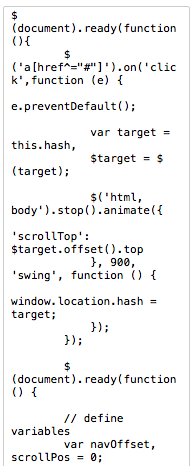
One of the best achievements of this assignment was exploring Jquery. I used Codeacademy  to understand the basic syntax of the code. I followed two Jqeury tutorials on You Tube to placed a fixed navigation bar and smooth scrolling functions on the website. This is to ensure that that the process of navigating through the website feels efficient and smooth.


I used Codedrops to insert a functional slider. However, the use of this interactive object was kept to a minimum to ensure the user does not get distracted regularly. There is an issue with the imagery not covering 100% of the slider but the background is not too striking.


http://www.smashingmagazine.com/2011/01/12/guidelines-for-responsive-web-design/

Friday, 30 May 2014

Reflections part 1

Design sprite

Exploring many solutions of presenting information about the coral reefs  on a website was a interesting and useful experience. I feel that the website design skills have improve since last year due to not limiting my concepts. I started with a couple of brainstorms that defined the audience, the machines that the website will be available on and the interaction. In order get some design and usability solutions, I created a mood board featuring the best looking website providing great usability. 


Doing these activities enabled me to quickly to perform a design sprite. This design sprite involved thinking of many possible layouts and design concepts. Once completed the 3 most achievable concepts were chosen to be developed. However, before I proceed to the next task, research into well known documentary based websites, such as the Discovery, was conducted . There was a sense that these websites had uninspiring designs that could discourage the users to explore the site. 

Great designed responsive website with great interaction were then analysed. Having a one long page in website was a very common practiced used by designers. I realised that the long page concept was ideas chosen from design sprite. However, I felt that creating multiple pages with 4 to 5 sections will allow the content to be split into smaller chunks. Although it will have the same concept as a long page website, I wanted to produce a site that was different, which could inspirer others. 

Graphic style


The time limitations and medium used to present the content forced me to simplified  my graphic style. Performing extra tasks and building a website within a short period of time prevented me from developing detailed 1950's illustrations. Silhouettes were used to ensure that the website would be made in time. Reflecting on the graphic style used on the site,  the retro designed silhouettes have a right balance of detail on a website. The symbols do not distract the user from reading the content.  There is a sense that placing these detailed illustrations on a site could ruin the hierarchy.  


Development

After doing some wire framing, I realised that websites with semi-long pages would be the most logical solution for attracting students to read about the coral reefs. With the home page, I thought of having a logical sequence where the user would read a sentence or two about the website. After reading, the user should be prompted to reading the introduction to understand the terminology.

With the other pages, I aimed for a website that guides them through the right path. To accomplish this, I planned my fonts size , hierarchy of information and imagery.  Majority of information from the Ibook is available on the website but I realised that Iphone and the landscape Ipad has less estate. This therefore caused me to categorised the content into three columns. To sort out the hierarchy, I separated the content into three columns, primary, secondary and tertiary. A decision was made to exclude the tertiary information on the Iphone.

With the content sorted, creating the mock ups and wire frames were then the most challenging aspects of this assignment. I was attempting to produce many samples of my site's design in order to gather constructive feedback. Making a wide range of mock ups allowed me to experiment with colour positioning and typography. Having enjoyable experience in creating the mock ups caused me to believe this is the correct path.

Knowing the columns and the positioning the graphical elements was more possibility the most non-linear process in the project. I had 4 possible choices to complete this task: just do the wire framing, produce wireframe whilst producing new compositional concepts, produce paper Iphones featuring the layout and then creating the wire framing.

 I felt that doing the rough sketches on the book and place them on Iphones enabled me to make important decisions. Using them resulted in gathering very constructive feedback that improved the layouts. With the feedback on board, I developed the wire frame featuring the elements, div tags and imagery. However, there were occasions where I produced new layout concepts whilst drawing the wireframes. When the wireframes are drawn, the process of drawing paper Iphones and developing the layout concepts were repeated.


Time management Responsive design and background design done

I have finally finished the footer navigation and a responsive vertical bar for mobile and graphics tablet devices. The development part of the my sketch shows the social media buttons positioned next to a horizontal navigation bar. I also intended to add pin points to make the hover effect look smooth. I followed a tutorial to achieve this on You Tube. I managed to implement this feature onto the social media icons to improve the user experience.

Another great achievement of this week was making-sure that the backgrounds imagery were inserted. I developed retro and 1950's style signs/logos to make the coral reefs website have a captivating theme for students to experience. Currently, the background property is set to display none on the mobile and landscape Ipad to ensure the main content's legibility is not reduced. However, I may place the symbols next to the top of the first paragraph to improve the content's readability.

Other than that, I just need to add 3 videos and make-sure that user testing is performed again to improve the site's usability and design.