I am an graphic enthusiast who is a student at Sussex Downs College. I am currently receiving training to become a professional graphic designer.
I decided to do the FDA Digital Design course because I am interested in motion graphics, styles of design and have a passion for illustrations.
One of the things I will mainly consider using in my video is the use of action sequences that would make a normal activity, such as making a cup of coffee look very intended.
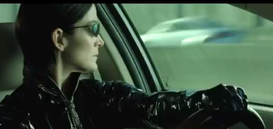
The first thing associated with fast scene were fights. One of the most famous fight scenes appears in Matrix Reloaded. Lets go through what the infamous action sequence offers.
From 0:01 to 0:03, the scenes reveals a villain shooting at a car. The most interesting aspect of the scene is after the second cut. The following scene shows the shooter’s perspective of shooting. As it turns out, he is trying to destroy the car. There are many behind and mid shots.
The scenes in the 0:03 to 0:14 features a large number of edits. The great use of cuts in the cars creates a flow and maintains the excitement. The most noticeable thing about the scene is when a edit is made as the woman turns her head. The following scene shows a slow motion clips of car flying in the air. There are 4 edits that show different perspectives of the scene, including an Aerial view and a low angle shot.
Another great scene is when the ghost enters the car at 0:26. An edit is made when a character in the cars move or dramatic events occurs. The camera focuses on the bold headed guy as he points a gun. After the gun is dropped , the camera reveals the gun’s destination. This is a great example to get inspiration from videos with loads of edits. The pace is maintained due to the use of very close shots.
Effects enhances the overall action sequence. The use of using fast motion effect on the person standing on the roof produces an interesting effect(1:46). As the person dodges the gun shot, there are duplicates of him.
Overall this is a great inspiration for effects and the number of edits. The feel of the sequence is striking and disorientating due to the use of camera views.
This a clip of a movie that appeals to the younger audience.
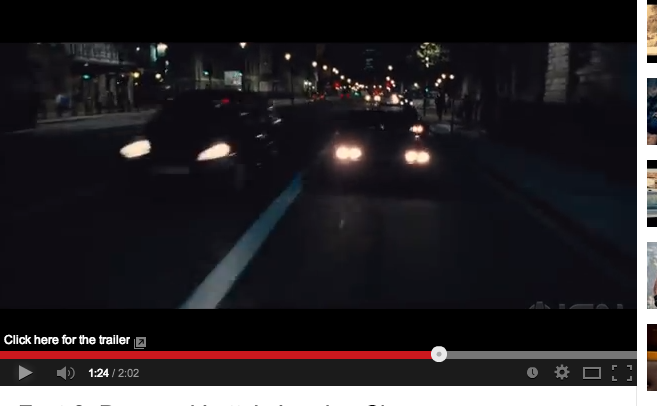
Although I am not a great fan of Too Fast and Furious, there are racing scenes are very captivating. The ready scene has the most effective edits. After the woman shouts out ready, suddenly a woman inside a car appears. After she says ready, suddenly there is loud racket of a car engine preparing to travel at fast speed. The scene is believable because the sound is accompanied by speedometer showing a high figure. The scene is fast enough for it to build the action.
Another great aspect of the clip is used of sound and lighting effects. The brightness of the car lights strikes the audiences’ eyes, allowing the scene to maintain its appeal.
The 1:12 to the end of the video is main focal point of this video is the race scene.I realised the edit occurs at 1 or 2 seconds.This characteristic conveys the racing theme and excitement of racing at a fast speed. An edit occurs when the cars turn, increase their speed or when the person is changing gears. This signifies that racing is intense and fast experience. This reinforces the movies title.
In order to produce this one of a kind clip, cameras costing over 1000 pounds minimum must have be positioned on fast production vehicles. The speed of the car applies that the camera is able to detect fast traveling objects. Having so many edits would suggest that the recording the entire clip must have taken 1-3 days. Storyboard must have been used to plan the entire sequence. Although doing this type of thing would be impossible for me. However, applying this concept to a everyday activating would captivate my audience.
Unlike the previous examples, this is less jarring due to the use of cross cut. Two different perspectives, the woman and the man, are presented to give a intense feel.
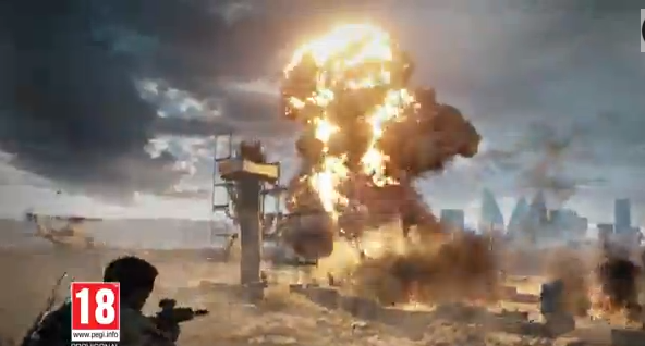
This a very intense 30 second advert that promote a popular game Battlefield 4. The first thing I realised with the video is the use of arbitrary signifiers, the publisher and the developer. The use of striking music and transitions makes the brands and the intro noticeable.
As for the other parts, guns, military equipment and action sequences signifier war. On denotation level this is a game with war. The only people who would appeal to this advert are Battlefield customers and general gamers. The explosive scene applies that this game is action orientated. The use of these scenes would make some people feel intensed.
The production of this trailer must have been time consuming and expensive. Getting the copyright for playing one of Rihanna’s songs as the audio must have cost them around £3000. This is based on my research on previous projects.
Moving onto the clip and camera, there are 35 edits within the 30 seconds. The intro has 2 edits with very striking transitions. This a great introduction because it immediately brings my attention of what the trailer is promoting.
For the remaining parts of the clip, the intensity of the scene changes from 2 seconds onwards is very fast. The edits correspond to the dramatic events and action, such as the man grabbing the gun from the other man. Many of the shots show the scene from the characters' point of view, It only last on 2 for two seconds. The gun scene is very effective because after the man gives the gun, the scenes changes and the movie then reveals the man going to shot the window. This brings a continuous path for the audience experience that is not jarring and not captivating. Another great examples of appropriate use of edit change is the people running from gunshots. As the man gets too close to the camera (close shot), the scene showing a different perspective of the action scene appears.
On the interesting note, there are 3 edits with fade in transitions at the 20 second mark. This is great effort of presenting the game’s environments. Suddenly at 23 seconds, title sequences interrupts its and then it is followed by a 1 second game play clip. This fast sequence is repeated many times, resulting a large number of edits to appear within 6 seconds.
Although it is not clear, the clip is accompanied by a striking
transition
The some of the fast edits have very striking transitions, making it jarring. However, the pace and the use of mixture long shot and point of view keeps the video captivating.
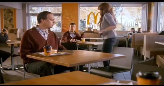
This is advert promoting food at fast food retail chain. This clip shows a McDonald store containing people having their breakfast. Immediately the viewer is forced to look at the iconic signifier, the Mcmuffin. When the woman enters the screen, there is one of the most symbolic signifier in the world, the McDonald’s logo. Majority of the scene show the logo in the background to get that this is an McDonald’s advert in their heads.
The overall feel of the advert is comical. After the woman realises that she sitting with a stranger, not her boyfriend, she immediately finds her boyfriend.
For the production many camera men and light equipment were used create a visual pleasing clips. They might have recorded about 1-3 hours worth of video content to ensure there is enough clips to inserting into the editing software.
Lets talk about the small number of edits within the McDonald’s advert. Unlike Battlefields advert, the scene length for this longer, making it less exciting. With less scene changes, there is a possibility that people would most likely to loose interest.
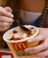
This shows the audience a second person’s view of 2 people having a meal. For the first 5 seconds, the camera reveals a close shot of a man eating a burger. Behind is a blurry background that makes him the main focal point. The camera changes just before she sits down. I realized that the edit on 0:04 is important because the following scene shows more products and the brand logo. The close shot of her scooping up the ice cream appears at the 7 second mark. The positioning of the logo on the ice cream container causes the logo to strike the viewer. Another edit appears when she eats the food, creating a good flow.
Another great feature of the advert when is the use of edits when a person is eating or speaking. At the 0:11, the man is moving his forward but when he eats it, a clip revealing him eating the cream from the font appears.
Overall, this advert features a great theme but does not contain enough edits to maintain the audiences’ attention. The reason why I conducted research on slow clips is to ensure that I know what not to do with a short clip with many edits. However, if dialog is used, I will explore the comedy theme.
Overall, the advert consists of mid shots. This is to allow the audience to see enough of the scenery(the resturant).
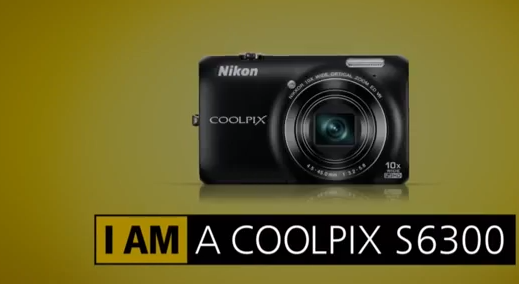
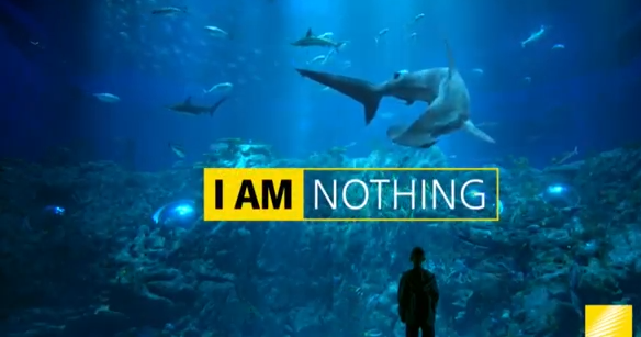
This is a Nikon advert promoting its camera range. The main element that signifies that their camera a great quality is the clips. Many of the clips are very vibrant and very clear. A great example of this is the shark scene. There is a high contrast and great lighting effects that represents the high quality of Nikon footage.
Unlike the previous examples the arbitrary signifier, the text, are also iconic. In the lot of scene, there is a girl resting. A text sequence showing a pun, ‘I am recharging’ that represents the feeling of resting. With the animation it connotes that the camera charges at a fast rate.
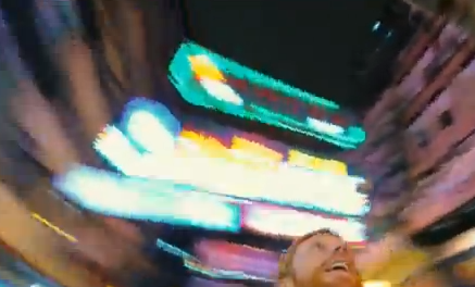
Another great signifier is the man moving his camera in an urban environment. This clip signifies that moving the camera would not ruin the quality and maintains the high frame rate. The use of a low angle shot and a eye view is an interesting shot. Swinging it around offers a great sense of movement.
Overall the audio is symbolic and iconic because there is no clear connection between the audio and the brand. However, many people may have heard this song on another Nikon advert, making it iconic. Whether it is royalty free music and produced by their talent, they have must used Audio editing software, like Adobe Audition, to achieve a great and high quality song.
The clip at 0:20 is great effect that people would most likely remember. The scene is unfocused and is zoomed in but it become clearer when the camera focuses on the lights. This is an interesting effect that is commonly used by professional editors of adverts and movies.
The footage is perfect example that demonstrates that edit can be a new object or element appear on the screen. After the second edit, text appears on the image. The then suddenly reveals animation, which is considered as an edit. The use of animated text is used on the following times: 0:12 and 0:22. Afterwards, there are 2 edits appear on screen; the appearance of text and the camera. This repeats itself many times by the colour the camera constantly changing and the text revealing the name of the model. This makes the last seconds of the trailer look interesting.
Cross cutting In film, cross cutting is regular used to established two parts of a story from different locations. There are many circumstances where one action scene is replaced by another. Creating suspense is the benefit of using this type of edit in a film. Chase sequences have this form of edit to create a captivating environment.
Medium shot: A medium shot is where the torso, hips, head and next are only see. However, scene only showing legs and hips is also classified as this. Point of view shot Point of view shots give a first person perspective of the character. The audience can only see the elements surrounding the character. The the name says it all. Jump cut Jump cut is style that the brief has ask to apply to our design. Films with this feature have This edits gives a sense of time going forward. Some people think that this form of editing looks unprofessional and too abrupt for the audience. However, it is very quick, making it very captivating.
Welcome to my first research post. This research will cover semiotics to break down the meaning of the video. I will also conduct an analysis for each example and a review.
For my first research post, I wanted to explore short clips from YouTube that provides similar content to the video that I will be developing. This is a simply a video that shows Santa Claus playing Ice hockey. As it is a video, it shows many iconic signifiers, Santa Claus, snow, ice, people skating and Hockey. Ice and the ball sliding are very recognisable indexical signifiers On a denotation level, these signifiers form a funny video showing people playing ice skating in very cold conditions.
According to the information, this video was released on the 19th of December. Having the famous character and the snow makes this a Christmas themed video. The thing I think that Santa punching the people signifies that it is a tongue and cheek way of saying that naughty children get punished for Christmas. People across the world would be able to identify the name and the visual language because santa claus is used in promotions, such as Coca Cola. The ice is an indexical signifier that connotes that the setting for this video is in either in Northern America or Northern Europe. Overall this a funny with a great theme that celebrates Christmas.
This clip is high quality and shows a great frame rate. This applies that the company purchase good quality cameras. There might be a possibility that this was taken by iPhone 5 due to the video being shown at 1080p. There have must have been many camera men and equipment to make the video smooth. To make the video smooth as possibility, this video was inserted into
The video starts with a short intro with 2 edits. The edits occurs when a transition appears on the indent. The length of the video is 4 seconds, which is long enough to promote the channel.
0:04 to 0:07 offers a good contrast of views of Santa Claus. The first clip reveals the character putting on his gloves from an ariel view. The next scene shows the camera looking at Santa from the ground. From 0:11 to 0:29, the number of edits are low but having many close and long shots of Santa playing with the ball captivates the audience. The long shows gives an interesting perspective on the character is playing with it whist the close shot only features the ball hit by a stick. Due the clips having different moves and showing something different, it feels that it is continuing on a liner path. The close shot also offers tension due to camera being close to the ground. There are 8 edit in that time scale. Point of view shot is a great that achieves a good feel
Form 0:29:0:36 feature a great scene showing Santa Claus punishing a naughty person. The scene reveals that the character punching him without showing the violence. This applies that the employers wanted sometime that would also appeal to a young audience. The rest of the video is very similar to the playing scenes but the last offers a great second person’s view on Santa Claus. The eye view is the term of this.
Overall the use of many camera shots and great perspective paints a picture that Ice Hockey is an exciting and fun. This may not be a good inspiration for my video in terms of edit number, it will develop my ideas on camera perspectives.
To enhance the clip, the audio synchs well with the pace with the move accompanies the clip. When the slip becomes slow, the beats sound bit slow.
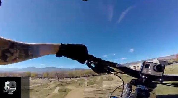
This is a video that is about sports and leisure. There are many iconic signifiers that signify that sports is his main profession. This ranges from bikes to skis. Immediately with the first edit, the stretching of the trampoline is caused by the person jumping on it, making it an indexical signifier.
Overall this video is about his training on his get himself to win the Winter Olympics. On a connotation level, showing the complex moves in skiing in slow motion helps people to be aware that the sport is tricky and the training has helped him. The high frame camera enables the footage to be recorded in slow motion
The initial scene which last for 6 seconds, reveals the great use of a high frame rate camera is used to make the first scene, which shows a young jumping on a trampolines, look very detailed and exit. As I mentioned in semiotics, a camera with 60 frames per second must have been used to achieve the slow motion effect.
From 0:08- 0:21 shows the journey he takes to ride a bike on an exciting course. The number of edits are high when the clips shows the bicycle in the car. When the clip reveals the man riding the bike, the scene is longer. This enables the audience to experience the excitement of seeing a detail bike course thats looks dangerous.
In terms of shots, the point of view is used to show the process clearly to the audience. The clip uses a jump cut to make this successful as a time based media clip. There is a scene where there is a bycycle by itself but suddenly you can see his hands.
The second trampoline scene shows the clip rotating to enhance the feeling on jumping on the thing. It may make people feel disorientated due to the rotation but it is a great thing to apply in clips. The slow motion effect is applied again at the point where the rotation meets its peak.
Slow motion and the Ariel views enhance the visual language from 0:25 onwards. The slow motion brings tension to the skiing scene because the high frame rate allows the audience to detail of the person’s movement, such as when he rotates his body to balance himself whist in the air.
This is a video with a similar theme. Instead what he does to train, he demonstrates he intends to surf.
The noticeable signifier that signify surfing were the beach, surf
boards, and swim gear. Company logos; for example Quick Silver’s, are
symbolic signifiers that have no clear connection to surfing. Arbitrary signifier appear as words on his swim gear.
The
water is an iconic signifier that really makes the overall clip look
professional. 0:47 reveals that the water is blue and has light
reflecting. This connotes that the sea is clean and fresh and the sun is
really bright. The use of disorientating camera is to give people an
insight the true experience riding a surfing underneath a large wave.
In contrast to the last example, the first show has a time-lapse feel.The time-lapse shows people the process of preparing for a surfing event. The pace of the waves is one indication of this.
There are many edits in the 0:03 to 0:17 time scale reveals a detailed journey of the surfer walking towards the sea. One suggestion of great video editing is the use of different scenes to tell a journey. In the clip where the surfer exits the building, the camera is facing to the right where the man is located. The next edit reveals the surfer walking from the left, towards the sea. It gives the transition a nice feel and enables the liner path to be clearly presenting to the target audience.
The most identifiable section of the video is in the 0:20 - 0:54. The first ten seconds reveals a second perspective on his face. The combination of slow motion, face movement and the water splashing brings tension. The slow motion reveals the detail of his mouth and face stretching. The next second edit shows the same perspective but the following scene reveals a wave. The surfer travels underneath the wave. The scene gives a distorting feel due to the angel of the wave and the surfer. The slow motion provides a great lighting effects.
I found a great time based media clip on Youtube. The content is about a woman waking and preparing to work. Instead of doing it in a professional manner, the clips have disorientating feel.
The style of editing used resembles of stock animation. Between the 13 and 18, there are more than 20 edits showing her going to bed. The use of this stock animation effect makes it obvious that this the editor used jump crossing. It looks amateur but looks very appealing and sucesfully conveys a time based event. At the 20 second mark, there is a non-diegetic sound being used to exaggerate the sound of the alarm. This signifies that the alarm is really loud and merciless. The remaining part of the video use this effect. As for the number of shots and edits, there must be hundreds of them. 3-5 hours of video must have been recorded for editor to select the best scenes. This demonstrates that the more clips taken, the production process offers more flexibility.
http://www.youtube.com/watch?v=3tz350gLFkk
Pyscho
There are many jump cuts in movies like phycho where it has 78 shots in the famous stabbing scene. To make the scene tense, a variety of high angle, eye and point of views shots. Rather than show clips showing the sequence from their perspective, the clip focuses on the woman. There are scenes where the woman is screaming and the following scene shows her body moving. The use of jump cut and having no transitions makes the pace look faster.
Overall the use of non-dietetic sounds is the main focal point. The whooshes and the water dripping sets the atmosphere. Overall this took 7 days to record
After we completed the book cover assignment, we were given a brief provides the instructions and the requirements of creating a catchy video. The name of the new assignment is Time Based Media. Time based are the words that signify video editing in my mind. When looking into the assignment, we all discovered that we will be creating a 15-20 second video sequence with the minimum of 30 edit. This video to show people an insight a journey or some other linear event. It must have elements of comedy, horror or present something in a post modern way. These events range from everyday events, such as tying a shoe to opening a door. We have the option of producing a 3 second intro with text to introduce the video. This will be addition to the 15-20 seconds. Here are the main requriements stated in the brief:
A 15-30 second clip
A minium of 30 clips
Using different audio
This is not compulsary- add an intro
Copyright source if audio is used
Using only 3 still images
Use sound to enhance the video showing the journey
Must be dynamic
Outsider where the assets come from
Insert any type of feeling into the clip(horror)
15-20 second clip
With that done let's talk about more about the indivual requirements. The aim for this project is to overall produce a 15-30 second clip. The assets have to be filmed and the edited in video editing software known as Final Cut Pro. I need to demonstrate that we have professionals skills in doing this. To achieve this we must apply screen shoots of the pre production and productions stages of our work. The solution to meet this requirement is to film the clips with the I phone. The phone itself is capable at recording at 720 and 1080p. To create an effective clip it is best to keep very simple, not filming a chase from London to Brighton. There would not be enough time for it to effectively show for its target audience. 30 edits for 20 seconds would mean the edits should be around 1.5 frames for each second. This means a lot of clips have to appear within one second or use multiple edits on one clip. In addition to this, we can include an introduced that will be added to the 3 second clip. 30 edits The other essential part of the assignment is the 30 edits. It states on the briefs that the minimum of 30 cuts. This means that I cannot use 29 edits because the clip would not be able to meet the brief. Edits is basically the change of scene. This includes the change of perspective, In breif I intend to use all 30 edits to create a product that is very entertaining. To create an interesting video, I will have to be adventurous by conducting detailed research, getting lots of inspirations and plan constantly. To plan effectively, I have to develop very detailed storyboards and sketches to ensure that the planning enables me to use the right scenes. 30 edits for 20 seconds would mean the edits should be around 1.5
frames for each second. This means a lot of clips have to appear within
one second or use multiple edits on one clip. In addition to this, we can include an introduced that will be added to the 3 second clip. To ensure that I have enough clips for 30 edits, it is recommended to film 40 minutes worth of video. Additional intro or outro This is one the optional parts of the video sequence. However, this must be 3 seconds long and it must appear at either at the intro or outro. It is most likely that I will use an intro to introduce my viewers to the content. I will most likely use text animation to ensure that the audience are captivated by the content. To get inspirations, I will conduct research into motion graphics and then create mood boards on my sketch book and justify my decisions. Adding a sequence is also essential to allow the audience to get the theme of the video immediately. An outro may not be included because I intend to produce a snappy video, a requirement of the brief. Sequence showing a journey With this video, I must show a journey that captivates the audience. To get ideas of the content video, I will conduct detail research into short clips that are funny and terrifying. This will range from Go Pro to blockbuster movies. The thing that the client suggest that it should only entertain, not interact. I will also explore very entertaining videos in the market. To start off the process, I will use my sketch book for brainstorming, sketches and mood boards. The storyboards on the other hand have to be sketched or photography and then exported as a PDF. This will be shown as evidence on the blog and on the server, which is the requirement. To create this video, I aim to produce 3 detailed storyboards for the general ideas and then select the chosen idea. There will be another story board that will go in depth in the edits. The story board will contain a minimum of 30 images.
Time Based Media
In video editing, it is a form of art that relies on dimension of time. As a medium, time based media are usually videos, pictures or audio. Time based media clips present the experience over a period of time. Many clips in this category have use a jump cross effect to make look amaturly edited. However, it does clearly help the editor to convey a sense of time in his or her videos. As for its history, this genre of videos date back to the 1960's. Bruce Norman presented a video showing happenings in his gallery. Ever since, this has inspired many artist and directors, including Alfred alfred hitchcock' phycho. I am putting some examples of jump editing and timed based media on the next article.
After an intense week, I have finally completed this document. Todays blogs will be the review about the finished products.
cover As for my alterations, I completed deleted the neon text because I believed that there were too many elements on the front cover. To compensate this, I had to get the text from Puffin books and then positioned it on the sign. However this left me too much negative space therefore, I added a signifier, a cigarette to signify the Greasers lifestyle. I addition to I had to made the signs smaller to ensure none of the elements overlap. Product
In order to react the to the feedback, I used the rule of 3s to rearrange my content. I sucessfully deleted the graphical elements to ensure that the poster is not too busy. Now doing the improvement, I think and peers think that it is a large improvement.
Today's pitch was another interesting experience. In terms of feedback many of my peers provided me with excellent constructive feedback. As for the feedback, the book cover's colour scheme and typography was praised. Many of my peers that the quality of the graphical elements, such as the signs, complimented the retro feel. One of my peers quoted that I my design demonstrates that I enjoy designing digital art. With praises, they must be constructed comments. Although my book poster had a very good layout, there were too many elements for the poster. To solve this, I have deleted the signs and the large road. People thought that the same issue occurred with the front cover. My peers suggested that having the neon text in addition to the quote. Positioning the text inside the red sign makes the page look less busy. However, to ensure there is no too many empty space, I will include an iconic signifier that gives the audience an insight of what the story provides. This also address the issue of the cover not conveying the gang theme. I also had to delete the words neon text because people thought that the use of the type of language in that context would not have been able to enter the competition.
I have been looking through a typography magazine and saw very good examples of free fonts from www.hypefontype.com. The Sanchez is very good for a content because it’s edges are rounded. This creates a balance and contrast to the structure. Readability is offered because the design resembles Rockwell, which is a popular font. This font has very good tracking when viewing it as a small piece of text. This makes the content legible and the serifs stand out, making the typeface compel the audiences’ eyes to read the line of text.
As for my branding guidelines, I have been using Corbert due to its elegant and modern text. This font's design is inspired by Bauhaus, making this text a good choice for presenting content. This text offers clarity and great legibility. Documentation instructing designers needs to look comprehensible, therefore, this is the great option for this.


 The scenes in the 0:03 to 0:14 features a large number of edits. The great use of cuts in the cars creates a flow and maintains the excitement. The most noticeable thing about the scene is when a edit is made as the woman turns her head. The following scene shows a slow motion clips of car flying in the air. There are 4 edits that show different perspectives of the scene, including an Aerial view and a low angle shot.


 The 1:12 to the end of the video is main focal point of this video is the race scene. I realised the edit occurs at 1 or 2 seconds. This characteristic conveys the racing theme and excitement of racing at a fast speed. An edit occurs when the cars turn, increase their speed or when the person is changing gears. This signifies that racing is intense and fast experience. This reinforces the movies title.
 In order to produce this one of a kind clip, cameras costing over 1000 pounds minimum must have be positioned on fast production vehicles. The speed of the car applies that the camera is able to detect fast traveling objects. Having so many edits would suggest that the recording the entire clip must have taken 1-3 days. Storyboard must have been used to plan the entire sequence.