The basics
Although I have not learn any new HTML and CSS elements, I have discovered to create a visually pleasing layout using skeleton. Skeleton is a frame work that positions content in columns. Overall there are 16 columns that designers can use structure the content. I participated in an interesting exercise where I had to produce a very complex layout for a website using columns. The experiment was a success but the behaviour of the block level element prevented me from adding a break line. Block level elements are at 100% width and 0% in height and are drawn to the top left corner. The underline only appeared underneath the shortest paragraph. A HTML 5 element row was added to ensure the underline appeared underneath all paragraphs in the row.
Another interesting tips was using the nth child ta. The second tutorial involved us targeting the first character in each div's paragraph. To achieve this, we had to enter the target as follow html container p::first-letter. The target states that inside the HTMl file there is a container but inside this element are p tags. The ::first-letter informs the browser to target the first character in the p tag. This helped me realised that I need to have concise class names, such as news section, to help my code to offer flexibility.
Codeacemy
http://www.codecademy.com is a great website for developing HTML and CSS skills. The website offers learners tutorials offer a learnable path and interactive text editor. Generally, the terms and the tags are professionally explained. I have recently finished the Jqery course, which was very useful. This post logs the very interesting tutorial.
Wednesday, 11 June 2014
methods of programming


I came to realisation that symbols with nice effects. I wrote the conventional navigation bar but a h4 tag was placed to pushed down the text below the imagery. I originally used an inline element known as a span class. However, span classes appear on a same line, therefore, a task was performed to make them block. The solution for this was to place the words into h4 tags.
Accessibility check

Evaulation
Since I have done an evaluation on my pre-production stage, I just as well reflect about the entire production stage. Adapting my design to the website has given me the experience of developing a professional website. The use of illustrator has enabled the website's content to captivate students. The retro icon are used to prevent the website from looking empty. Although skeleton was being used, I did not used that restraint as an excuse to make a visually pleasing website.
I placed a section class outside the container to create a 100% backgrounds. The process of adding these backgrounds was an easy process due to some CSS3 properties being available. Background size and positioned allowed me to place the retro logos as intended.
Overall the home page features a simple paragraph with the navigation below. I thought that Home pages should introduce the user the subject within a couple of sentences. The original plan with the home page was to place the introduction underneath the navigation. However, I thought that completing this task would have been time consuming. A decision was made to place the introduction on the overview page.
User testing 2 and problem solving reflection

After I consolidated with the changes, I managed to user test with a couple of friends of mine. I presented the old and new versions of the site. Same as before, I asked them to perform a certain tasks without assistance. One of the improvements they realised was the quantity of text. They suggested that reducing the text causes the website to feel understandable. They also pointed out there was not enough contrast between the navigation and the main content area. In response to this, I applied a blue background to the navigation area.
Problem solving reflection
One of the disturbing effects that was encountered was the mobile navigation pushing down the graphical elements. This was because I accidentally made the navigation exit the flow of the document. To solve this, a tutorial was followed that enabled me to enhance the user experience. Generally the Jquery code allowed it to not disturbed the other elements.

Accessibility

Improvements


Although I am pleased with the website, I felt that the time restraints caused me to come out with other solutions. The navigation bar features nice retro designed icons, I feel that skeleton made my options limited due to its 960px container. There is a method of making the container into percentages but performing this takes would have consumed a lot of time. As mentioned in my technical research, there are still people having large screens. In future, I may use bootstrap to make a 100% and free flowing website.
Tuesday, 10 June 2014
Crit Feedback
Critics gave me very constructive feedback that will enable me to improve the website's user experience. Generally the website was praised for its use of illustrations to make the website look captivating. The general theme and the use of imagery could draw the audience to read the website.
Today's post will focus on the suggestions given. Although there were minor issues, the quantity of content was a massive issue. One constructively stated that the quantity of the text makes the information overbearing and causes the layout to feel cramped. In response to this, the number of text is dramatically reduced.
One peer thought that having a fixed navigation bar is illogical due to the footer. I decided this was a strong case therefore, I removed the Jquery and the CSS that causes the graphical element to appear at the top of the page. Other than replacing a few images, there is not much to do for this task.
Saturday, 7 June 2014
User Testing and time management.
So far with my user testing, I managed to test my website on three people. I generally know them but I pretended that the website presented was not mine. This was to ensure that the users could give useful constructive feedback. I used paper Iphones for user testing to ensure that they enable me to develop the best concepts. Last week, I managed to test my prototype on these 3 people. I asked questions that prevented them from quoting yes or no. Whilst the user was performing the tasks given, I was viewing for any hesitations and their face expressions.
The most common problem with the website was the home page. They suggested that the background and the symbols are very striking elements, therefore it caused them to read the short paragraph lasts. To solve this issue, the text colour and scale were altered. The font size was set to 18px in order to sort the hierarchy structure.
time management
Performing this task last enabled me to make the amendments to the website. Relating to time management, I thought that doing this activity the week before the extended deadline helped to improve the website's design. At the moment, I have been logging my progress and adding elements to improve the user experience.
Friday, 6 June 2014
Logging of code
Learning code
 One of the things I have learned on this project is to make-sure that the plugins or code are necessary for the user to experience. Using many plugins on CodeDrops could have made me lazy in terms of writing code. I managed to learn new code by watching You Tube videos. I was able to understand the overall code due to the presenter talking about the instructions and code. Understanding the syntax rather than placing a plugin improve my learning. A slider plugin was used but I watched a simple tutorial discussing about the code required to create the interactive element. Due to fast approaching deadlines, I realised that coding a error free image gallery would have been impossible. However, I managed to separate the code into small parts to understand the CSS.
CSS3 code

Generally, CSS3 has prevented me from using image swap. The issue with image swap is the increase of bandwidth. The browsers has to make more hits to display the image, making uploading process a lot longer. In the late production stage, I realised that there a webkit feature known as filters. There are wide range of websites offering tutorials on how to apply them on websites. I studied the code on a couple of website before using it. Using RGB as a colour format instead Hex is a key component of this code. Experimenting with the code caused me to conclude changing the opacity and alpha channels for the RGB colours makes this colour format more flexible than the Hex pallet.
website blogging
CSS and HTMl Validator

I reinserted my CSS code until there was not any errors on W3's website. Correcting the mistakes resulted in a well-done message appearing on a site. The code below allows me to place a W3 CSS3 tested certificate onto my website. Adding this symbol will signify to users that this site is trustworthy. Trustworthy is a key aspect of user experience design that web developers should consider when in the planning and production stage.

However, validator has a problem at recognising figure caption and CSS3 functions. Even though captions are new tags, validator do not recognise them. Webfilters are other properties that validators have struggle to recognise. However, I have attempted to correct many errors as possible. It may appear that have more errors than usual.
Z-index
A confliction between the navigation bar and SVG logos caused me to explore the Z-index. The SVG logos appeared a front of the fixed navigation links. W3schools points out that the z-index function arrange the graphical elements into layers resembling the ones used in Photoshop. The graphical element with the highest value appears on the top layer. With my experience with CSS, I set the z-index at 100 for the navigation whilst 99 for the SVG logos. At first, I thought that this solution may not work due to my lack of experience using this specific code but the website was seen on browsers, the confliction disappeared. This experience taught me to make-sure that add the z-index to ensure that graphical elements do not collide.
Wednesday, 4 June 2014
web filter

Illustrations

While looking at my sketchbook I realised that having a globe map revealing the location of the famous reefs was an efficient concept. After doing some drawing I managed develop an idea where the user would click the image, which takes them to a particular reef. For example, having the user selecting the image showing the New Caledonia's reef locations causes the website to scroll down the the Caledonia sub section.

In response of my feedback from the previous Ibook project, I have produced diagrams featuring the website's graphic style and colour scheme. Overall, a artistic brush was created to make the smoke look believable. Shadows had to inserted to give the diagram depth. There is a fish diagram being developed as well.
Tuesday, 3 June 2014
my website code part 1
My design

Overall, the feedback about my design style has been very positive. The simple design enables the content to be nice presented on all devices. I decided to apply flat colours with simple retro signs and shilouutes. The retro signs improves the readability for the content of the site. The darker tone of blue draws the users eyes to the paragraph after reading the heading, which is very important.
 For my footer, I decided to include a border featuring corals. This was to ensure the user notices that this is the end of the page. Placing an image as a border for every section was the orginal plan but experimenting with the feature causes me to realised that this would make the website look clunky.
There are some graphs or diagrams that will be placed on the website. I feel that these diagrams need to be captivating, so I inserted the resources on Illustrator and then drew them using the pen tool. The final outcome shows graphs showing my visual style. Graphs can come across as uninteresting but applying visual style could allow them to catch the user's attention.
As a visual learner, I felt that incorporating symbols and words for the navigation system could entice the user to explore the subject of coral reefs. Students are captivated by imagery therefore, it made sense to me that applying the retro designed symbols can enhance the user experience.
Positive

The project overall has allowed me to enter a interesting journey. I found sketching all of my designees and referring to them in the production stage was very useful. On the image above, building the website was an easy tasks because I planned the number of columns in my sketchbook. I planned the elements that are fixed and fluid. Naming my div tags in my sketchbook allowed me to insert the right backgrounds and colours. I placed a lot of illustrations as background into each section without making mistakes. I placed all of the backgrounds as I intended.
Negative
One of the many drawbacks for this projects was the workload. I felt that getting the right hierarchy and the user experience caused me to sketch regularly. I was drawing many layouts, concepts and design elements in order get the website that targets the right audience. I had to developed a few brainstorms to truly understand the website's content and purpose. I realised journey is very essential part of the design, which will help me develop children's books over the summer hoildays
There are some graphs or diagrams that will be placed on the website. I feel that these diagrams need to be captivating, so I inserted the resources on Illustrator and then drew them using the pen tool. The final outcome shows graphs showing my visual style. Graphs can come across as uninteresting but applying visual style could allow them to catch the user's attention.
As a visual learner, I felt that incorporating symbols and words for the navigation system could entice the user to explore the subject of coral reefs. Students are captivated by imagery therefore, it made sense to me that applying the retro designed symbols can enhance the user experience.
Positive
The project overall has allowed me to enter a interesting journey. I found sketching all of my designees and referring to them in the production stage was very useful. On the image above, building the website was an easy tasks because I planned the number of columns in my sketchbook. I planned the elements that are fixed and fluid. Naming my div tags in my sketchbook allowed me to insert the right backgrounds and colours. I placed a lot of illustrations as background into each section without making mistakes. I placed all of the backgrounds as I intended.
Negative
 |
| A lot of planning went into this navigation bar |
One of the many drawbacks for this projects was the workload. I felt that getting the right hierarchy and the user experience caused me to sketch regularly. I was drawing many layouts, concepts and design elements in order get the website that targets the right audience. I had to developed a few brainstorms to truly understand the website's content and purpose. I realised journey is very essential part of the design, which will help me develop children's books over the summer hoildays
Saturday, 31 May 2014
Logging the work and define responsive design
Responsive design

One of the things I forgotten to place in this blog is defining responsive design. Responsive is a keyword that defines the term "responsive design' as a design that accommodates the user's environment based on the device and the screen size. The use of media quires allow designers to create one website that respond to the user's needs. At the moment website developers design sites that accommodate users using mobile phone, graphics tablet and desktop.
Flexibility is one benefit of making a website responsive. The use of percentages on website images enables the designers to produce sites that includes all important graphical elements that enable the user to understand the information. It also shortens the process of adjusting the image's size to suit each device's screen.
Responsive design also shorten the workload in the production stage. Many frameworks features responsive columns that are measured in percentages. Using a responsive framework allows the imagery and content to be automatically repositioned and rescaled, making the website look structured on all devices.
CSS
One of the things I have learned is to use dirty markup to tidy my code. There was a moment where understanding my code was almost impossible. Solving this required me to place the CSS into the website that processed the mark up and then presents the code clearly. This has taught me the importances of following common house keeping tips to make the code look understandable.
There are some practices being following to make CSS that look logically correct. CSS tags are positioned in the correct sub sections. I managed to used commenting as headings to help me locate code. Designing from the outside in also caused me to design the graphical elements with ease.
Jquery

One of the best achievements of this assignment was exploring Jquery. I used Codeacademy to understand the basic syntax of the code. I followed two Jqeury tutorials on You Tube to placed a fixed navigation bar and smooth scrolling functions on the website. This is to ensure that that the process of navigating through the website feels efficient and smooth.


I used Codedrops to insert a functional slider. However, the use of this interactive object was kept to a minimum to ensure the user does not get distracted regularly. There is an issue with the imagery not covering 100% of the slider but the background is not too striking.
http://www.smashingmagazine.com/2011/01/12/guidelines-for-responsive-web-design/
One of the things I forgotten to place in this blog is defining responsive design. Responsive is a keyword that defines the term "responsive design' as a design that accommodates the user's environment based on the device and the screen size. The use of media quires allow designers to create one website that respond to the user's needs. At the moment website developers design sites that accommodate users using mobile phone, graphics tablet and desktop.
Flexibility is one benefit of making a website responsive. The use of percentages on website images enables the designers to produce sites that includes all important graphical elements that enable the user to understand the information. It also shortens the process of adjusting the image's size to suit each device's screen.
Responsive design also shorten the workload in the production stage. Many frameworks features responsive columns that are measured in percentages. Using a responsive framework allows the imagery and content to be automatically repositioned and rescaled, making the website look structured on all devices.
CSS
One of the things I have learned is to use dirty markup to tidy my code. There was a moment where understanding my code was almost impossible. Solving this required me to place the CSS into the website that processed the mark up and then presents the code clearly. This has taught me the importances of following common house keeping tips to make the code look understandable.
There are some practices being following to make CSS that look logically correct. CSS tags are positioned in the correct sub sections. I managed to used commenting as headings to help me locate code. Designing from the outside in also caused me to design the graphical elements with ease.
Jquery
One of the best achievements of this assignment was exploring Jquery. I used Codeacademy to understand the basic syntax of the code. I followed two Jqeury tutorials on You Tube to placed a fixed navigation bar and smooth scrolling functions on the website. This is to ensure that that the process of navigating through the website feels efficient and smooth.
I used Codedrops to insert a functional slider. However, the use of this interactive object was kept to a minimum to ensure the user does not get distracted regularly. There is an issue with the imagery not covering 100% of the slider but the background is not too striking.
http://www.smashingmagazine.com/2011/01/12/guidelines-for-responsive-web-design/
Friday, 30 May 2014
Reflections part 1
Design sprite
Exploring many solutions of presenting information about the coral reefs on a website was a interesting and useful experience. I feel that the website design skills have improve since last year due to not limiting my concepts. I started with a couple of brainstorms that defined the audience, the machines that the website will be available on and the interaction. In order get some design and usability solutions, I created a mood board featuring the best looking website providing great usability.
Doing these activities enabled me to quickly to perform a design sprite. This design sprite involved thinking of many possible layouts and design concepts. Once completed the 3 most achievable concepts were chosen to be developed. However, before I proceed to the next task, research into well known documentary based websites, such as the Discovery, was conducted . There was a sense that these websites had uninspiring designs that could discourage the users to explore the site.
Great designed responsive website with great interaction were then analysed. Having a one long page in website was a very common practiced used by designers. I realised that the long page concept was ideas chosen from design sprite. However, I felt that creating multiple pages with 4 to 5 sections will allow the content to be split into smaller chunks. Although it will have the same concept as a long page website, I wanted to produce a site that was different, which could inspirer others.
Graphic style
Development
After doing some wire framing, I realised that websites with semi-long pages would be the most logical solution for attracting students to read about the coral reefs. With the home page, I thought of having a logical sequence where the user would read a sentence or two about the website. After reading, the user should be prompted to reading the introduction to understand the terminology.
With the other pages, I aimed for a website that guides them through the right path. To accomplish this, I planned my fonts size , hierarchy of information and imagery. Majority of information from the Ibook is available on the website but I realised that Iphone and the landscape Ipad has less estate. This therefore caused me to categorised the content into three columns. To sort out the hierarchy, I separated the content into three columns, primary, secondary and tertiary. A decision was made to exclude the tertiary information on the Iphone.
With the content sorted, creating the mock ups and wire frames were then the most challenging aspects of this assignment. I was attempting to produce many samples of my site's design in order to gather constructive feedback. Making a wide range of mock ups allowed me to experiment with colour positioning and typography. Having enjoyable experience in creating the mock ups caused me to believe this is the correct path.
Knowing the columns and the positioning the graphical elements was more possibility the most non-linear process in the project. I had 4 possible choices to complete this task: just do the wire framing, produce wireframe whilst producing new compositional concepts, produce paper Iphones featuring the layout and then creating the wire framing.
I felt that doing the rough sketches on the book and place them on Iphones enabled me to make important decisions. Using them resulted in gathering very constructive feedback that improved the layouts. With the feedback on board, I developed the wire frame featuring the elements, div tags and imagery. However, there were occasions where I produced new layout concepts whilst drawing the wireframes. When the wireframes are drawn, the process of drawing paper Iphones and developing the layout concepts were repeated.
The time limitations and medium used to present the content forced me to simplified my graphic style. Performing extra tasks and building a website within a short period of time prevented me from developing detailed 1950's illustrations. Silhouettes were used to ensure that the website would be made in time. Reflecting on the graphic style used on the site, the retro designed silhouettes have a right balance of detail on a website. The symbols do not distract the user from reading the content. There is a sense that placing these detailed illustrations on a site could ruin the hierarchy.
Development
After doing some wire framing, I realised that websites with semi-long pages would be the most logical solution for attracting students to read about the coral reefs. With the home page, I thought of having a logical sequence where the user would read a sentence or two about the website. After reading, the user should be prompted to reading the introduction to understand the terminology.
With the other pages, I aimed for a website that guides them through the right path. To accomplish this, I planned my fonts size , hierarchy of information and imagery. Majority of information from the Ibook is available on the website but I realised that Iphone and the landscape Ipad has less estate. This therefore caused me to categorised the content into three columns. To sort out the hierarchy, I separated the content into three columns, primary, secondary and tertiary. A decision was made to exclude the tertiary information on the Iphone.
With the content sorted, creating the mock ups and wire frames were then the most challenging aspects of this assignment. I was attempting to produce many samples of my site's design in order to gather constructive feedback. Making a wide range of mock ups allowed me to experiment with colour positioning and typography. Having enjoyable experience in creating the mock ups caused me to believe this is the correct path.
Knowing the columns and the positioning the graphical elements was more possibility the most non-linear process in the project. I had 4 possible choices to complete this task: just do the wire framing, produce wireframe whilst producing new compositional concepts, produce paper Iphones featuring the layout and then creating the wire framing.
I felt that doing the rough sketches on the book and place them on Iphones enabled me to make important decisions. Using them resulted in gathering very constructive feedback that improved the layouts. With the feedback on board, I developed the wire frame featuring the elements, div tags and imagery. However, there were occasions where I produced new layout concepts whilst drawing the wireframes. When the wireframes are drawn, the process of drawing paper Iphones and developing the layout concepts were repeated.
Time management Responsive design and background design done
I have finally finished the footer navigation and a responsive vertical bar for mobile and graphics tablet devices. The development part of the my sketch shows the social media buttons positioned next to a horizontal navigation bar. I also intended to add pin points to make the hover effect look smooth. I followed a tutorial to achieve this on You Tube. I managed to implement this feature onto the social media icons to improve the user experience.
Another great achievement of this week was making-sure that the backgrounds imagery were inserted. I developed retro and 1950's style signs/logos to make the coral reefs website have a captivating theme for students to experience. Currently, the background property is set to display none on the mobile and landscape Ipad to ensure the main content's legibility is not reduced. However, I may place the symbols next to the top of the first paragraph to improve the content's readability.
Other than that, I just need to add 3 videos and make-sure that user testing is performed again to improve the site's usability and design.
Thursday, 22 May 2014
Time management: website
Creating the responsive website
One of the key things that I will enable me to meet the deadline is the implementation of content with HTML escape characters and optimised images. With my planning, including naming the div tags, I have completed this process very quickly. In addition, I have inserted the typography, headings and the general colour scheme. Overall, my website is about 60 to 75 percent.
Deleting the unnecessary sections and altering the layout for the Ipad and Iphone websites are the next task. The process will not be too time consuming because I have placed div tags called, primary, secondary and tertiary. Tags with the value of tertiary do not appear on the Iphone website whilst with other div classes appear on other versions of the site.
With graphical elements produced, I will have to place a retro design image over a solid colour background. Retro is a great theme that represents my graphic style and coral reefs. Completing this task is quick process due to my knowledge of inserting background imagery to block level elements.
One of the key outcomes of this assignment is to use validator to check both css and html. I had problems with the positioning property for on of the images. At the time, I was unaware how to solve this issue so I placed the html to W3 html validator find any typographic or syntax errors. The results presented a div class that was wrongly placed in the html document. The image was placed in the intended position once the error was corrected.
Navigation and proposal
Navigation
The structure of the site is a very logical aspect of the site. A conclusion was made that the website needs to have less pages to ensure that target audience do not have their experience clicking too many buttons. The solution for was to include pages that features sections of content. Each page represents a chapter from the Ibooks.
In terms of hierarchy, I realised that the students need to follow a logical and semi-linear path in order to understand the information. The home page will consist of a tag line, a sentence of text buttons leading to the chapters. The overview page would be a great place for students to start. The page givens them an over view of the coral reefs. The information explains each page's content to allow them to comprehend the structure of the website. There will be an image gallery or a video to visually entice them to enter the website. This webpage should feature a link to the first chapter should allow them follow the right path.
For each chapter, there will be a button that guides the user to individual sections. This is to ensure that they do not have perform scrolling for long periods of time. Giving the users the ability to navigate through the large page can allow them to find the content appealing to them. This feature would enhance the website on the Iphone because scrolling down using touch can give a sluggish experience
Instead of adding internal pages, I realised that pop ups or expand boxes could be great idea. Intend to create a simple website structure that prevents them from getting lost. However, there might be a couple scenarios where an internal page will be included to present graphs and videos.
Responsive design and layouts
Iphone
Designing the website on the phone was easiest part of the process. The phone features only the 3 line symbol signifying the navigation, the basic text and some interaction. I made a decision to make some secondary and tertiary information unseen on the Iphone. This device has less estate, therefore it would be wise to include only the necessary information.
The navigation on the Iphone differs compared to its Ipad and desktop counterparts. The 3 lined symbol will be used to present a vertical drop down bar on the web page. This is to ensure that the navigation design is still usable and the scale of the website is not too long. The home page will only consist of a overview button logo to en
The layout and the hierarchy is among the most basic aspects of the design. There is only 1 column filled with information and images to ensure the content is readable and looks visually pleasing. An image Lightbox effect will be applied to ensure that the user can view the images without straining their eyes.
Each section will have its own colour scheme to help the user differentiate the sections. Many of design website follow this practice to make usable and attractive websites. Inspired by this design, I thought that using coral silhouettes as borders would make the theme consistent.
Ipad
The layout and design for both Ipad changes in terms of layout, content and imagery. All primary and secondary information will be included on the tablet site. Majority of the tertiary contetn will be available as well. The content may have links to pop up menus to present more information. However, there will be a choice of using the appear and disappearing function.
The scaling of the imagry and composition are the biggest alterations. The screen resolution on the Ipad are larger, therefore there is an increase of empty space. This negative space will features more columns of content. two or three is the ideal number for graphics tablet.
Another aspect that changes is the navigation design. The home page will feature the chapter icons underneath the overview button. Tablet users can select the larger retro styled icons to navigate through the website. The navigation site map also changes due to empty space. There is enough room for the site map links to be positioned horizontally along the bottom part of the page. Due to learning Javascript, I have decided that a feedback forum should be provided to ensure that feedback from users can be gathered.
Dekstop
Generally the composition and the scaling slightly changes in the desktop version. The imagery will be larger to ensure it accommodates users with Imacs and laptops. Generally though the website will be around 960 px in width as screen sizes are becoming smaller.
This layout concept is assigned to the desktop site only. The desktop features enough space to feature a paragraph of text next to a large image. This is very common on design agency websites, such as Done Done.
colour
#D44D52
Red is the colour that establishes hierarchy to help the students explore the website. As this is a very striking colour, I concluded that this red mild chroma red could make the logo and the important links standout. The intense of the red compliments the blue-green background and offers the user a sense of vibrancy.
#95B6BB
This is a quite a pale blue that creates a massive contrast to the shaded green and the vibrant red. Generally blue was the common background colour for the Ibooks therefore, it would make sense to apply this colour to the website. Generally blue symbolises the nature and the sea, this therefore would convey the right meaning. This colour should represent 60% of the colour scheme.
#C74327
#BAE3E8 and #8CCCD3
Although separating sections using different colours is a great concept, there is an issue of making a website resembling lego. Colours similar to the blue should be included to ensure the sections do not look too striking. The footer will only be the only section that has a different colour.
Friday, 9 May 2014
Time management 2

My time management for this week has been professional. I have been able to adapt to the presentation date change and still completed the planning stage of the site. The process after the presentation was starting on the graphics. However, to ensure I get the right image size right, I took my mock ups and started inventing the div tags. On the same page, I wrote down the necessary div classes for all sections and graphical elements on the site. This list of classes will act as a checklist that will enable me to prevent myself from writing dirty code.
With the task completed, I focused on developing the retro style illustrations on Friday. So far I have managed to create navigation buttons, and some picture frames. The only things to complete is the hover images and the fade illustrations for the background. This process will not take long because the sketch book features all of my designs that compliment the website theme.
On Saturday I will experiment with a fixed navigation bar using JQeury and Javascript. The other more difficult graphical elements, such as animation and sprites will be tested on a dummy website. This will enable me to fix plugins' flaws and change their designs to suit my website. In terms of time management, this will prevent me from wasting
With the checklist and the experiments, building the website should be quick experience.
Wednesday, 7 May 2014
Presentation Review
Generally there was very good constructive feedback given but I felt there should have more useful information that could have improved my design. Paul suggested to me that the home button was not obvious to the user. In response to this suggestion, I will plan to enhance the user experience by including a banner containing an icon symbolising home.
From this point, I will need to upload more technical research posts. As for planning the site, I have already named my class names. I am going to present my layouts to some people to get a rough idea to improve on. The last task will be measuring the scale the images, text and other graphical element to ensure I can produce the graphical assets before the digital conference.
As for user testing, I have developed paper Ipads for users to interact with. Doing this stage very early will indicate the positive and negative aspects of the website without spending too much time on a product that could fail.
Monday, 5 May 2014
Responsive websites part 3
More research
Today's post will focus on the responsive design of these websites and the buttons used to present the navigation links. I have taken 3 websites that are very responsive and reviewed their features.

When viewed on the desktop, I thought the website conveyed a sketch book feel. The desktop website features massive text positioned on dark blue squares. Although this works on the links the content may look overwhelming. However, the content and the page design alters in the Ipad version. The Ipad website reveals a sketched designed navigation buttons that enhances the visual experience. A appearing text reveals the name of the page that is linked to the page.
Generally it does make the the website feel unprofessionally designed due the navigation elements only appears on the Ipad and mobile sites. This may cause the user to have a difficult experience in navigating through the website.
A nice addition to the website is

The designer has considered the hierarchy of information in his website design. The Ipad version features an avatar next to some some content and states. Both kinds of the content are positioned near the image to establish connection between them.
There is an issue with the word, about me heading. Placing the text onto a box could apply a navigation link. I media selected the text when I saw the graphical object. When the cursor clicks, no actions took place.

To ensure the
http://iwantobeafootballplayer.com/

This web agency has an excellent phone website. When I viewed this on the phone, the graphical element looked and web page composition. The website features one column filled with content and imagery. The use of empty or negative space makes the website come across as understandable. The visually pleasing and colourful website would entice the audience to explore the website.

The typography is the website's boldest aspect.. The script face conveys a retro feel that adds a vintage characteristic. Both script and italic san serif font face a mixed together to create some contrast into the the heading design. Generally it also enhances the visual imagery. The top hot often symbolises history and old fashion, therefore, the illustrations blend with the website theme.

The navigation one the desktop version is quite unusable due to its scale. The navigation is positioned on the right part of the website but the scale of the links are too massive to fit onto the page, thus reducing the user experience. However, the phone website features the very convention drop down menu. When the icon with 3 lines is activated, a drop menu with the centred aligned text.
As for the navigation design, it is very elegant and it does work. The mobile site has its own navigation page that is very usable. The vertical navigation bar is positioned to the centre. The links are surrounded by large amount of padding, making the composition look clean.
http://fixedagency.com/en/portfolio
Friday, 2 May 2014
Time management
Hi all. This is my time management post that will offer you information about the task completed already.
The date of the presentation had to be delayed by a week due to one of the peers not being able to attend. I was suppose to present on the tuesday or Wednesday but the tutor was not available. As a result, the presentation is now on the following Tuesday. This is slightly problematic because I reserved a week to prepare my graphical assets and plan all of the dimensions. In response to this problem, I have focused in creating very detailed wireframes and mock ups to get the feel and look of the website. Generally, I still need to prepare to plan my website to ensure that I create the digital assets before the digital conference.
Previously, I have conducted research on a wide range of design websites and technical content. I have finished the visual research into existing responsive websites and the retro styled websites. Overall, I have logged some very important topics of designing a website.
 |
| This is the consolidated schedule that shows that now presentation is now on the 6th of may |
The date of the presentation had to be delayed by a week due to one of the peers not being able to attend. I was suppose to present on the tuesday or Wednesday but the tutor was not available. As a result, the presentation is now on the following Tuesday. This is slightly problematic because I reserved a week to prepare my graphical assets and plan all of the dimensions. In response to this problem, I have focused in creating very detailed wireframes and mock ups to get the feel and look of the website. Generally, I still need to prepare to plan my website to ensure that I create the digital assets before the digital conference.
Previously, I have conducted research on a wide range of design websites and technical content. I have finished the visual research into existing responsive websites and the retro styled websites. Overall, I have logged some very important topics of designing a website.
Wednesday, 23 April 2014
Inspirations for design and layout and best practice research
This blog discusses about the inspirational responsive websites seen on the web. The split the websites listed below in many categories: layout, graphical elements, colour and typography. They identfy what they have to offer for responsive design.
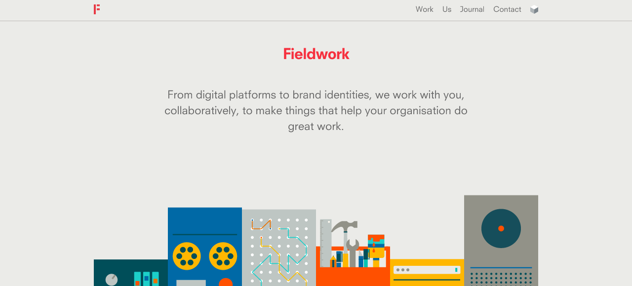
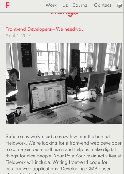
Both Field work and Done Done are very inspirational websites with great quality content. They both feature a sentence or 2 that describes the website. A home page should feature a navigation bar with a sentence about the subject in order to prompt user to explore the website.

With Field work, I enjoy the concept that the illustrations make the website look clean and visually pleasing. They all signify what the website offers without reading the content. As for responsive websites, the designer has successfully designed a phone site with these illustrations. In order for Iphone home page to work, the quantity of illustrations were reduced.
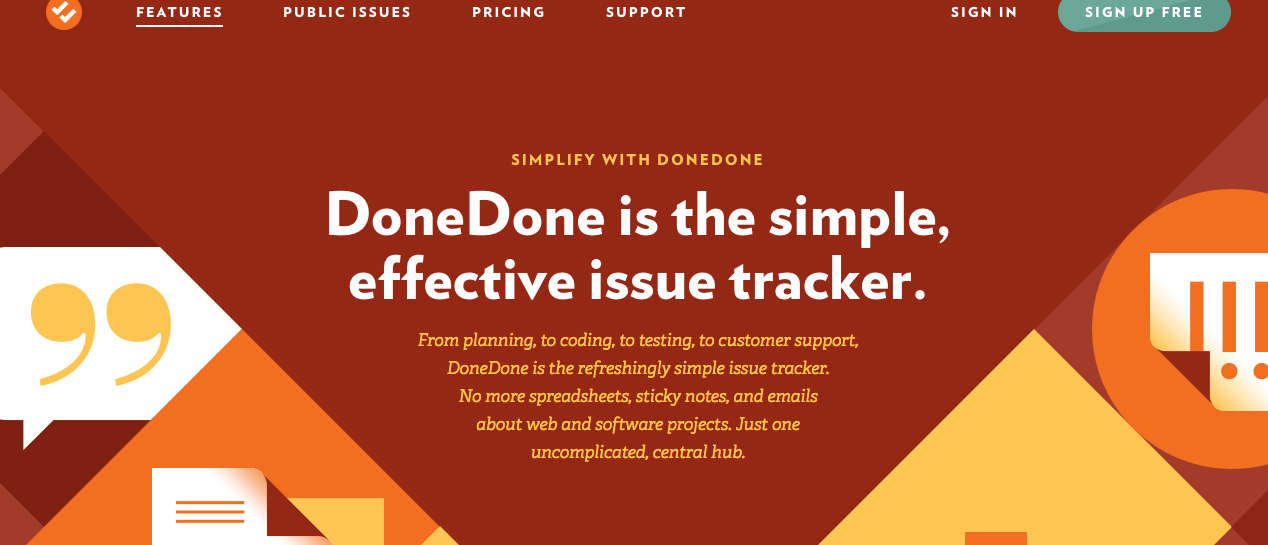
Done Done is another great website with great content style. Many of its pages feature one or two paragraphs next to a very visually effective illustration. Differtiating each section is a great attribute that separates the content into small blocks. Each topic has its own section of the page where it features its own colour scheme, illustration and headings.
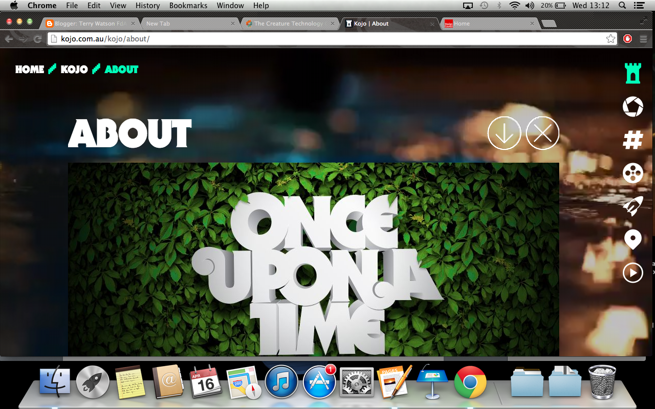 Kojo.co.au features a very visual and very responsive navigation bar. The symbols are great imagery for students, the target audience. Many students are visual learners, therefore having symbols as well as word may alert to know the subject that the linked page offers. When the navigation is hovered, the image slightly rotates. This makes it obvious to the student that the links is active.
http://missmarysmix.com/
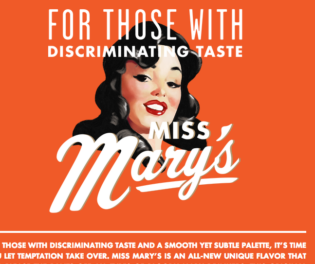 As retro was the visual style used in the Ibooks, it would make sense to conduct research in vintaged designed illustrations. I thought the typography found on missmarymix would be great grab the student's attention. The script face font is very reminiscent of many font found on retro designed posters. One of the main aims for the website is to create noticeable moments in the site that will cause the audience remember the content and style. The script face font will only be used to present additonal information of the image.
A normal san serif would be used as headings. Bold san serif text allows to focus on the heading. San sanifs font feel more democratic, therefore using the san serif fonts would convey the right theme.
Using many type families within the same font to establish hierarchy is a great practice. The content body text is smaller and looks less bold. These factors enable the heading to stand out. A website with massive content, such as mine, having this characteristic would enhance the user experience.
 Colour and feel are the main reasons I anaylised the website below. The colour scheme used for the Ibooks consisted of many cool colours, such as greens and blues. There was often orange and white to allow my design to create the correct hierarchy structure.
This website has a similar colour scheme. The use of the 60 30 10 rule enables this website be visually engaging. The website uses a great range greens to add depth. I generally feel the use of solid colour causes the page to look trendy and clean. Placing red, orange and white in the most important parts of the site enables the audience to get the necessary information they need. I felt applying the same method of establishing hierarcy would enable the students to learn coral reefs.
 I have realised that modern websites have one simple background colour. Applying clean colours to the coral website would allow the website to appear visually pleasing on future devices. Using many shades of the colour is another design decison that improves the website's interface. Using many shades creates a modern feel that student would like to view.
The layout is another successful component. Each column has its own image or illustration above the heading and text. When the website is viewed on the Ipad, it just reduces the scale of both the columns and the images. As mention I thing that having 3 images on a row rather than having 2 does not require the user to scroll. I would admit that the Iphone version should have 1 column of info.
Referring to Filed Work's website, the content is underneath a massive image that consumes the entire width of the site. To make it proportionally look right, the headings are smaller to ensure the page looks balance.
Content
Both Field work and Done Done are very inspirational websites with great quality content. They both feature a sentence or 2 that describes the website. A home page should feature a navigation bar with a sentence about the subject in order to prompt user to explore the website.
With Field work, I enjoy the concept that the illustrations make the website look clean and visually pleasing. They all signify what the website offers without reading the content. As for responsive websites, the designer has successfully designed a phone site with these illustrations. In order for Iphone home page to work, the quantity of illustrations were reduced.
Done Done is another great website with great content style. Many of its pages feature one or two paragraphs next to a very visually effective illustration. Differtiating each section is a great attribute that separates the content into small blocks. Each topic has its own section of the page where it features its own colour scheme, illustration and headings.
Navigation
Kojo.co.au features a very visual and very responsive navigation bar. The symbols are great imagery for students, the target audience. Many students are visual learners, therefore having symbols as well as word may alert to know the subject that the linked page offers. When the navigation is hovered, the image slightly rotates. This makes it obvious to the student that the links is active.Imagery, colour and typography
http://missmarysmix.com/
As retro was the visual style used in the Ibooks, it would make sense to conduct research in vintaged designed illustrations. I thought the typography found on missmarymix would be great grab the student's attention. The script face font is very reminiscent of many font found on retro designed posters. One of the main aims for the website is to create noticeable moments in the site that will cause the audience remember the content and style. The script face font will only be used to present additonal information of the image.A normal san serif would be used as headings. Bold san serif text allows to focus on the heading. San sanifs font feel more democratic, therefore using the san serif fonts would convey the right theme.
Using many type families within the same font to establish hierarchy is a great practice. The content body text is smaller and looks less bold. These factors enable the heading to stand out. A website with massive content, such as mine, having this characteristic would enhance the user experience.
This website has a similar colour scheme. The use of the 60 30 10 rule enables this website be visually engaging. The website uses a great range greens to add depth. I generally feel the use of solid colour causes the page to look trendy and clean. Placing red, orange and white in the most important parts of the site enables the audience to get the necessary information they need. I felt applying the same method of establishing hierarcy would enable the students to learn coral reefs.
The layout is another successful component. Each column has its own image or illustration above the heading and text. When the website is viewed on the Ipad, it just reduces the scale of both the columns and the images. As mention I thing that having 3 images on a row rather than having 2 does not require the user to scroll. I would admit that the Iphone version should have 1 column of info.

Referring to Filed Work's website, the content is underneath a massive image that consumes the entire width of the site. To make it proportionally look right, the headings are smaller to ensure the page looks balance.
technical research
Joomal CMN
Joomal is a great content management systems that allows website developers and clients to change the website's content. It offers users a simple interface that allows them to insert HTML elements, such as video, without knowing the code. Making the content dynamic is one benefit of using a content management system. Clients or employees who have accessed to the website can correct, edit or add the information.
Hosting
Websites need hosting in order for them to presented on the internet. Hosting companies provide clients with domain names, the url, databases and other advance features. The price of getting the domain name depends on status of the clients. It is common for clients to pay a business tariff in order to get more domain names and perks. Reg123 also provide a premium tariff that give businesses unlimited access to some tools; for example the databases.
Tuesday, 22 April 2014
NICE responsive website
Trafic light
Design
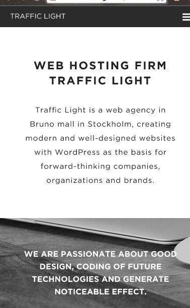
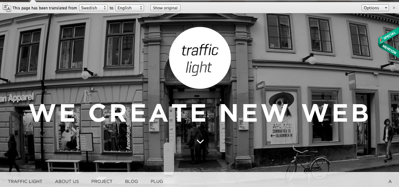 When observing at the image effects and the graphical elements, I thought the website offered a vintage and retro feel. The use of vector shapes, such as the circle, makes the website look clean on the screen. This is a great practice to follow because website need to look visually pleasing on future devices.
  Simple is the key word to describe the page designs. The designer has chosen to apply a nice simple background that offers clarity and uniformity. Using white and black enables the images to blend in. This helps the website to establish a relationship between the pictures and pictures. The black and white filtered applied on the imagery causes them to strike the audiences' eyes. This results in the pictures being among on top levels of hierarchy.
Typography

There is a great use of many type families presented on all pages. The bold Helvetica font entices the audience to red the tagline 'we create new web'. Applying capitals gives a sense of power to the headings and tag lines. Upper case letters are used to signify shouting or offer posters the ability to encourage customers to take a course of action
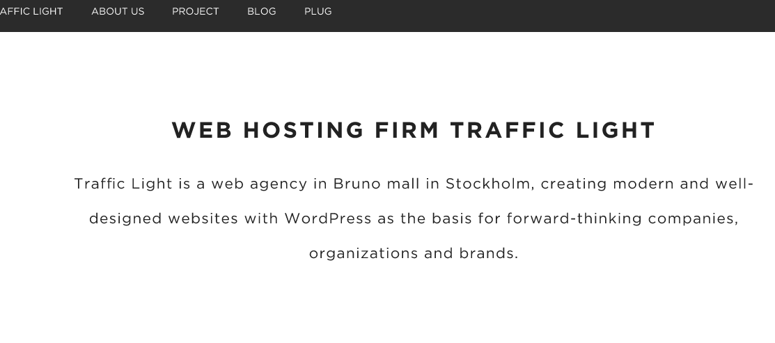
Design navigation and animation
The designer has done a professional job at presenting a massive vertical navigation bar. The scale of the text makes the process of navigating through the website is easy. The pop up menu features a nice transition that makes the navigation look smoothe.
However, the navigation bar on the home page looks slightly out of place. The other pages feature a horizontal navigation bar on the top of the page whilst the home page navigation is postioned at the bottom. Although it can work if there is enough striking elements that causing the navigation bar to be the 2nd focal point, having just a white background for the links does not achieve that.
Responsive design
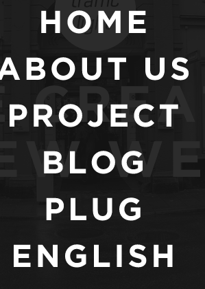
When I scaled down the website, both the Iphone and the Ipad website were professionally designed. One of the dramatic changes in the design is the navigation. The image below presents the home button on the top right of the banner. The left section of the header features a navigation drop down menu leading to all sections of the site. Being a fixed navigation bar causes it to be seen at all times, therefore, making the process of navigating to other very quick.
Having the text centrally justified is another great typography feature. Justifying the text cleanly presents the content to the user. The font and and the content are highly legible and readable on both iPad and iPhone

The layout on the desktop and the Ipad versions are very simliar in certain aspects. There are 3 image c presented on the row on both versions. It common for Ipad sites to only have two columns but the designer has chosen to make the image florid. The image seen on the Ipad are smaller compared to the computer website.
http://www.trafficlight.se/
Shokunin
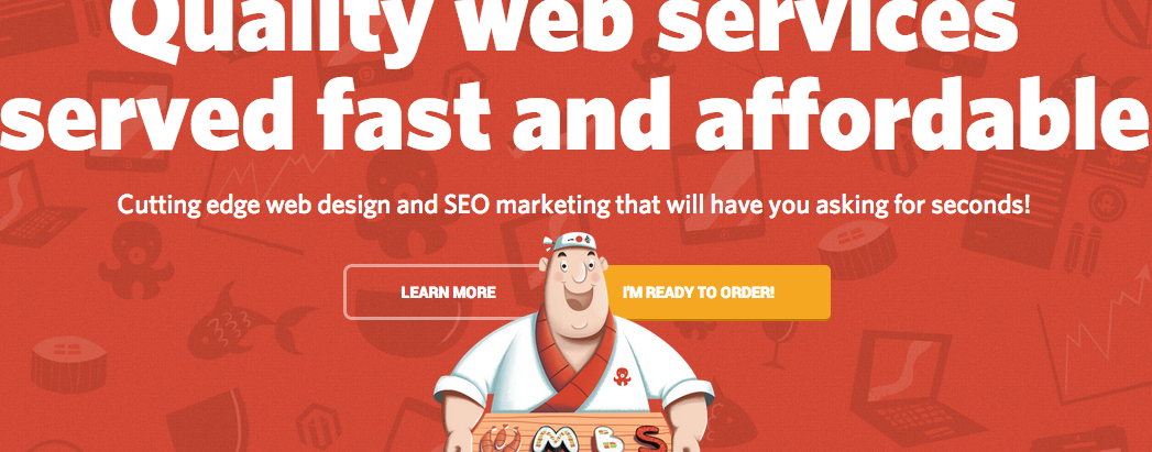
Skokunin is a very imaginative website with relevant content and very effective use of colour and typography. The home page reveals a detailed illustration of a waiter that acts as metaphor for serving a great web service. The background features red but there are slightly faded web themed illustrations to enable the user to figure out the website's theme and products.
As for the content, I enjoyed the concept of using puns make this website look comical. The word 'Can I take your order' is a link that would apply ordering food. However, this leads the users to an application for hiring the web services.
Typography is one of its boldest components. Presenting one font's type families makes the website look consistent and simple. The headings feature bold character whilst body content feature the regular letter forms.

The colour conveys a sense of happiness and power. In context red is often is to assoicate China and its food. The colour compliments with the comical theme and compliments the yellow and white. Against a white background, the red comes across as elegant.

The interactive page is the most engaging part of the website experience. The image shown below is an image gallery positioned inside a graphics tablet illustrations. Although the section needs captions to explain each picture, the detail and the visual imagery makes this one of the most memorial parts of the website.
Responsive design
Responsive design
I generally think that the phone and the graphics tablet website is very engaging. The header only reveals the tagline and the link that takes the user to application form. The empty white space makes the content very visual. The website is quite text heavy but the spacing on the phone site creates relationships between the image and the content more than the content website.
As for the layout, the Ipad version cramps the content and images together. Websites with cramped information maybe off putting.
Navigation and interactive elements
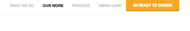 Unlike other websites seen, activating a link causes a very fast moving animation sequence to occur. When the user selects ' I'm ready to order' button, the website immediately scrolls down to the bottom part at a fast pace. There is a form that enables user to input the details. Beneath it are 4 links that allows the customer to select the kinds of service required.
However the navigation is quite unusable when viewed on the phone and a graphics tablet. When the 3 lined button is press, the website presents a new page with the primary links. However the illustrations overlap the links, making the text illegible.
http://www.shokunin.pro/en
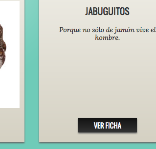
I thought to get some retro design inspriation, I decided to conduct some research onto a retro designed website. When I entered the webs page, my initially thought the design was very vibrant. The colour scheme generally signify nature. The use of pale and strong great offers the design great depth and elegancy. The complementary colour red is draws the audiences' eye to the tag line and the brand name.


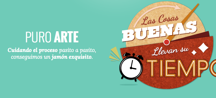 The visual imagery on the site creates an enjoyable user experience. The imagery is relevant because they all promote an aspect of the surface. Although the website is written in Spanish, the clock image is adverting that the food company does take aways or their restaurant surfaces are very efficient. However there should more information and links that helps the user to find all the information needed in all pages.
Having a search for info button enables the user to explore secondary information. The boxes containing them feature a simple heading and a brief description about the image. This may prompt the user to select the link and navigate to the related page. Overall it is a great concept but I think it may divert the audience from the path. Having too many pages causes the navigation process to be bit confusing. My solution to the issue is to present a box with a short paragraph but there should be a button that reveals the remaining content.
Navigation and links
 One of unique buttons featured is the mute and sound on button. When the button showing a microphone is activated, suddenly music can be heard. It is a creative concept but I do not think is a good relevent feature. There should be another element that is more essential for user to interact.
The positioning of the social media website links could cause people to leave the website. Social media links are OK but they should the last part of the hierarchy. I would advise the design to place the links down to the bottom of the page.
Although the navigation bar resembles the one analysed in the article, there a problem with the programming. When viewed on the Ipad, there is no navigation bar and no site map. This makes it impossible for either the Ipad or the Iphone user to navigate. This will prompt them to leave the website.
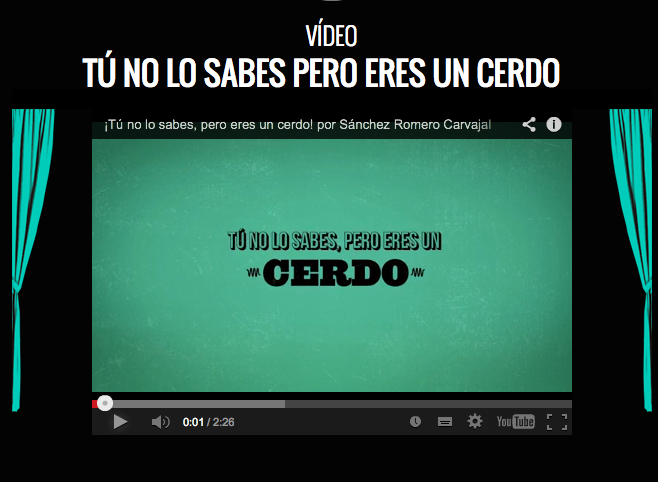 The other interactive elements I enjoyed viewing is the video. The imagery surrounding the YouTube video offers a cinematic feel that creates an enjoyable experience. This design attribute prompted me to view the clip. The layout and consistent use of one font also made page look visually pleasing.
http://sanchezromerocarvajal.com/la-jamoneta
Design and responsive design
 The illustrations are one of the most visually striking graphical elements on the home page. These vibrant illustrations add a creative feel. The illustrations first signify that the company produces art and web work. Against the background, the elements really standout.
  Red is a very elegant colour that draws the user onto the headers within the website. This enhances the reading experience because it allows the to use the headings as reference points. The quanity of text does not become overwhelming due to the strong heading design.
Typography is
Responsive design
 The designer has professionally designed the website for all devices. The design as really done a great job at making the content presentable on the other pages. I realised that the presenting 3 columns of information on the Ipad is very common. Not making the web page long reduces the need of scrolling in long periods. As a designer, I would present the information very efficiently.
I do enjoy the concept of not adding too many characters per line on the Iphone version. The phone site reveals 1 column of information. However the scale and the choice of font causes the content maintain the audience's attention.
Navigation
 The horizonal bar is very interesting when viewed on all devices. The navigation links are postioned nearer to the centre of the page when the width of page is reduced. However, there was a button that I have never came across before. There was a buttons that reveals a drop menu for the other information. It is common for drop down menus to reveal sub sections. There is a sense of the drop down menu has been unprofessionally design. There are some links without an underline, which suggests that they are not active links. It many take a long time for the user to figure which out of these words are links.
http://madebyfieldwork.com/
Subscribe to:
Comments (Atom)