According to the brief, the overall theme on both the Ibook and the responsive website have to match, making it consistent. When looking for inspirations, I initially searched for nature illustrations as a starting point. There are two talented artists that I aim to focus on today
Tang Yau Hoong is a Malaysian who is designs products that uses positive and negative space. The designs below are relevant designs for my overall theme and cover design due to the detail of the iconic images the animals.
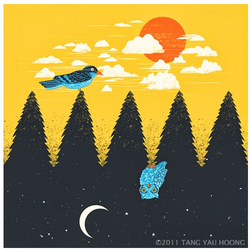 This image design focuses on a ying and yang feel. Night and day are the two contrasts featured in this interesting art work. There is loads of detail being applied to the birds' feathers. Outlines, the highlights and the shadows gives the imagery(birds) depth. Applying this style of character design would be a great addition to my designs.
 A great colour scheme applied on the animals features different tints and shades of blue. The bright and high chroma blue allows the imagery strike the audience's eyes. The use of a shaded blue also makes the animals look natural and easy on the eye. Analogous colors appear on side by side on the colour wheel. They are commonly are featured on photos of nature. Blue, dark blue and purple is an example of this.

This is another example of a poster using negative and positive space. I am inspired how the artist used an image of a house to mask the African landscape. One of the boldest traits is the use of using a big image of the house. The large composition enables many animals to appear to in shape. This iconic imagery provides enough information to the audience that this poster signifies the African countryside.
Having the colour of the tree correspond with the background enable the closure and the figure and ground make an impact. Using closure causes the masking to look smoother and less jarring.

This is one of my favourite logo designs created by the man listed above. The use of figure and ground makes the overall logo design look captivating. There is one variation of the design has a blue text and background. Overall I enjoy the concept of making the audience perceive the image of the scenery as the background. As a possible cover design book the e pub, it may stand out.
The overall the highly tinted blue allows the image to look relaxing. Blue signifies sea and nature, therefore, this could be one of the possible colour schemes on both website and I book. I think that combining it with colour with darker shades and higher chroma would enable the visual elements to stand out.
Photoshop is the primary program used to create this image. Photoshop is the industry standard software for enhance photoshops. It can be seen that the designer increased the contrast whilst the saturation is lowered to make the image look softer. A clipping mask is applied onto the image to create this design.
http://www.behance.net/gallery/The-Art-of-Negative-Space/1316541
http://www.behance.net/gallery/Personal-Identity-Mark/14757223
No comments:
Post a Comment